 Mandaris
Just a little reminder to everyone, that you can restart something if you want to. Also, if you want to stop something, you can do that too. Me? I’m staring at the MAN IN THE MIRROR 🎤.
I want to go play pirate themed miniature golf. ⛳
I want to as well!
They Cloned Tyrone, 2023 - ★★★★
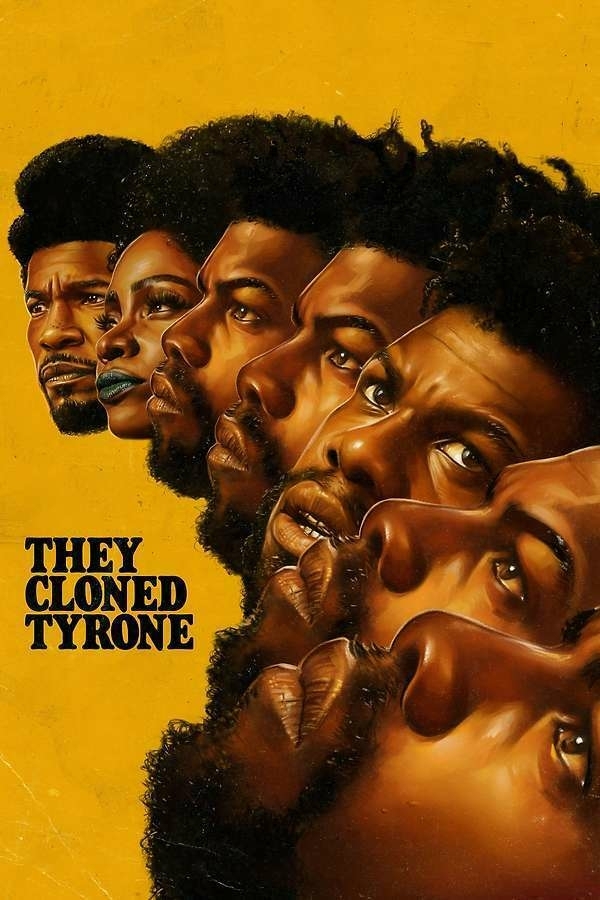
I’ve been looking forward to this movie for a while. I feel that John Boyega was wasted in the Star Wars sequels and this shows a little more of what he can do.
This film has a lot going for it and highly recommend it!
They Cloned Tyrone, 2023 - ★★★★

I’ve been looking forward to this movie for a while. I feel that John Boyega was wasted in the Star Wars sequels and this shows a little more of what he can do.
This film has a lot going for it and highly recommend it!
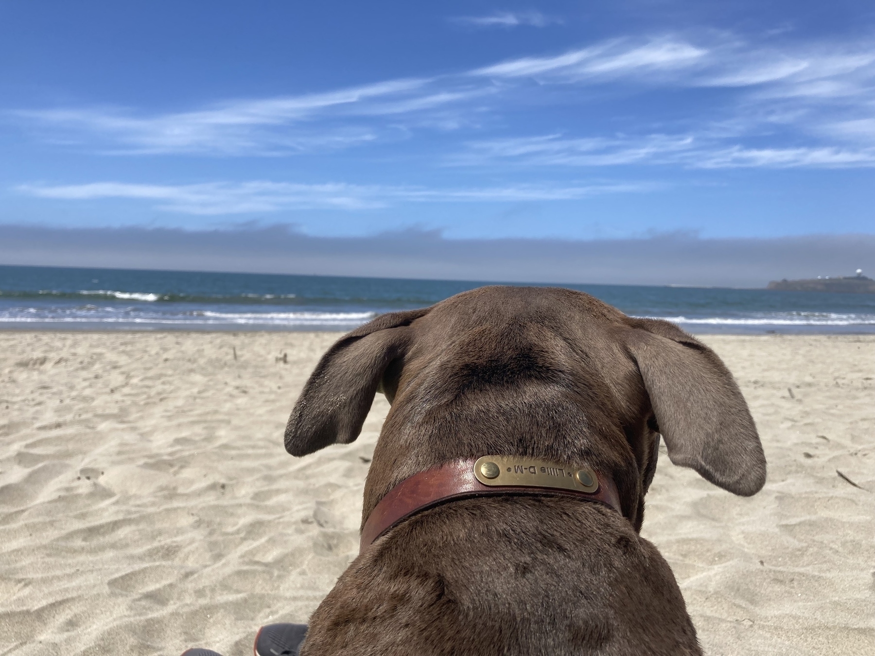
Another day at the beach.
I’ve got a post that I’ve had in drafts for a couple of weeks. It definitely borders on one of those posts that maybe shouldn’t be posted.
I’m still happy to have written it even though it will never see the light of the internet. It allowed me to put my feelings into words and re-evaluate.
I hope everyone is getting an opportunity to start the day off well.
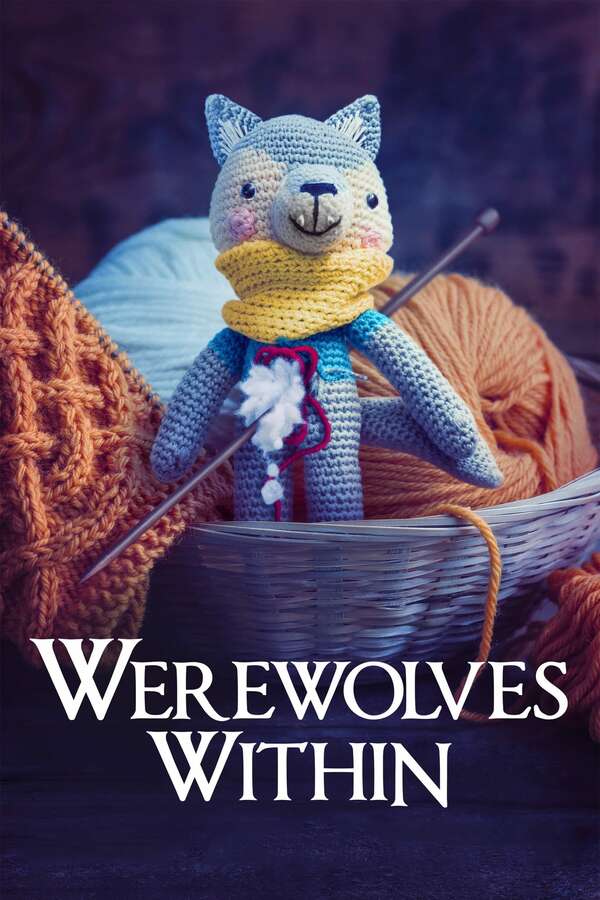
Werewolves Within, 2021 - ★★★½

It’s just what you are expecting and executed wonderfully. I had spoiled the ending but just watching the plot unfold was really satisfying.
Lots of actors that I’ve seen around in other media.
Werewolves Within, 2021 - ★★★½
It’s just what you are expecting and executed wonderfully. I had spoiled the ending but just watching the plot unfold was really satisfying.
Lots of actors that I’ve seen around in other media.
Is anyone using moviedb instead of Letterboxd for their media tracking? If so, are you putting that information into micro.blog?