 Mandaris
Feeling a little down. Going to plan some time to workout. 🏋🏾♂️
I’m having trouble getting started today.
Supergirl (2026) - ★★★☆☆

Not a super great movie.
Overall, I liked the movie. I wanted to like it more. I was ready to see someone get in there and be a hero, but I left the movie with a feeling of indifference.
Why?
I think it might be that this movie isn’t much different from other superhero movies that I’ve already seen in other movies. It really emphasizes that the execution of the story is very important.
I’m not saying that this is a bad movie. It has some good visual effects. It has some nice moments that pulled at my heartstrings. It’s got this CGI dog that appears in my nightmares…
After a time away from seeing it, I feel that I would not want to see it again.
Overview
When an unexpected and ruthless adversary strikes too close to home, Kara Zor-El, aka Supergirl, reluctantly joins forces with an unlikely companion on an epic, interstellar journey of vengeance and justice.
Watched: Dark Matter S1E8, Jupiter 🍿
One more episode left and this one was very good!
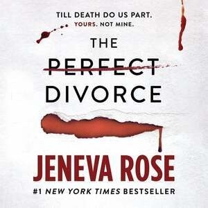
Finished reading: The Perfect Divorce by Jeneva Rose 📚
I don’t like most of the characters in the book. I’m reading in order to see if and when they get what’s coming to them. Sometimes, I yell at them to think. For some reason, they can’t hear me.
I’m reminded that I like the feeling of having a plan and seeing it change versus no plan at all and seeing the chaos take over.
They will kill you - ★★★☆☆
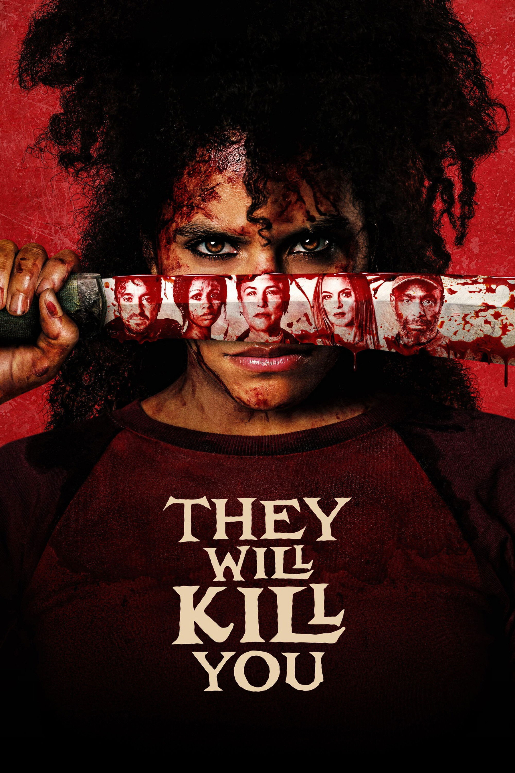
I love a good beat 'em up movie. Seeing the protagonist face off against dozens of indistinguist minions as they make their way to their objective. I feel that this movie does a great job of establishing the story and characters and then getting out of the way to let the action happen.
I was hooked on this movie from the moment I saw the trailer. I was so excited that I created a reminder to check if the film would be available to stream in a couple months from this writing. I remember showing everyone in my family the trailer just for them to shrug and ask if I would like to watch Bridgerton instead.
That’s ok, I’ll just watch it on my own. I started watching it and I was treated to 90 minutes of punches, kicks, and slap(stick)! If you liked movies such as Boy Kills World (2024) or Boss Level (2021), I think you might like this one as well.
Overview
A woman answers a help wanted ad to be a housekeeper in a mysterious New York City high-rise, unaware that she is entering a community that has seen a number of disappearances over the years and may be under the grip of a Satanic cult.
I feel that when people say “the only thing stopping you is you”, it doesn’t give you credit or blame for the fact you’ve been using your power to destroy your own dreams and aspirations.
Good job me! I’m dealing with the stuff you haven’t dealt with.
Somewhat joking. 🙃
Went to a rose garden today.
