Web Development

Admonish the Callout

Alert triangle with an exclamation icon

Micro.blog has recently enabled Hugo v0.158.0 for usage. The last version available to users was v0.117.0 and v0.140.0. And as Jason has pointed out on his blog, there are some big changes.

One of the changes of note was the inclusion of render hooks for callouts included in v0.132.0. This is coupled with the enhancements in v0.134 makes it more compatible with GitHub, Obsidian, and Typora.

The whole goal of this is to have markdown text like the following

> [!NOTE]
> Useful information that users should know, even when skimming content.

generate HTML and have the browser render into the following example

In case there is an error with processing the markdown, I’ve placed a static version of the HTML in this document below.

I wanted to implement this because I sometimes play around with Obsidian and I really enjoy Otávio’s plugin to publish to Micro.blog. With this, I can have the website follow the behavior of reading mode in Obsidian. I started writing this post in December of 2024. I ran into some issues along the way, but I kept coming back to this. At this point, some of the references are no longer available. My desire for writing in a way where I would use this functionality is no longer there.

But, it’s cool, and I know that there might be someone out there who can use this.

I set up a gallery of examples using the list of callouts from the Obsidian Callout Manager. You can look at the text used to make the examples to see if this is something that you want to incorporate into your writing.

I’ve tagged this particular release on GitHub so you can see exactly what I’m using at the time of this writing.

If you have any questions or suggestions, feel free to email me.

Resources

I’m leaning heavily on the resources that I’ve found on the internet. I want to take a moment to recognize their work and others can get it directly from the source.

Nicholas Martignoni’s Hugo Notice
This is a plugin that I saw a while ago and was thinking about putting into my theme before the official release of render hooks.
Liu Jinyi
This is where I got the final design for the admonitions from. I decided to make some changes so that it matches the style that I wanted to go for. At beginning of this project, the build system I was using did not allows for sass.

Creating the callout

HTML structure of the callout where an aside element contains two nested elements; a header and a div. The header contains a svg and h3 tag.
Diagrams help me think of the overall structure as a combination of different blocks.

When it comes to designing, I like to take inspiration from what is already available. I spent a lot of time goofing off researching how other people have implemented this and tried static version of those in my theme to see what I liked and didn’t like. Sometimes this takes up a lot of time as I try to understand why the original authors make certain decisions. Is it a technical or design choice that makes someone use <blockquote> or <div> for the final product?

This article about pullquotes better articulates why I use <aside> instead of <blockquote>. I have seen people use <figure>, but choose not to because I feel that figures are an essential part of the document while <aside> is additive.

I also went with a <header> inside of the admonition in the hopes that I’ll better understand how the different pieces come together. In addition, I used the <h3> tag to meet up with the heading convention that I’ve been using. I see the callouts as section of the document that contains information

I placed the content in a <div> for logistics and styling.

Iconic Icons

For the <svg>, I took some time to understand how they work in HTML and Hugo. I was already in the process of adding SVG icons to the site to make it stand out more. SVG stands for Scalable Vector Graphics. They are text representation of a graphic that we can embed within the document for the browser to render.

These are some that popular sites where you can get SVGs.

tabler icons
When I started looking into adding icons, this was one of the first links that came into my search.
font awesome
This is where Roneo got his icons. It’s a great option that is used in a lot projects on the internet.
Simple Icons
Another good set of icons.
Lucide
These are the icons that GitHub uses.
Iconify Design
This is a nice directory of icons that show you a small preview of the style icon libraries.

If you use any of these options, I want to encourage you to make a donation so that they can continue with the cool stuff that they are providing.

I went with the tabler icons, because I felt that the rounder style matches the ascetic that I’m going for when I started the site.

I’m in the process of implementing icons within my markdown after reading an article about SVG imbeds1 but that’s for a future post.

If you are into reading more about SVGs, there is a free book on SVG that I’m thinking about adding to the list.
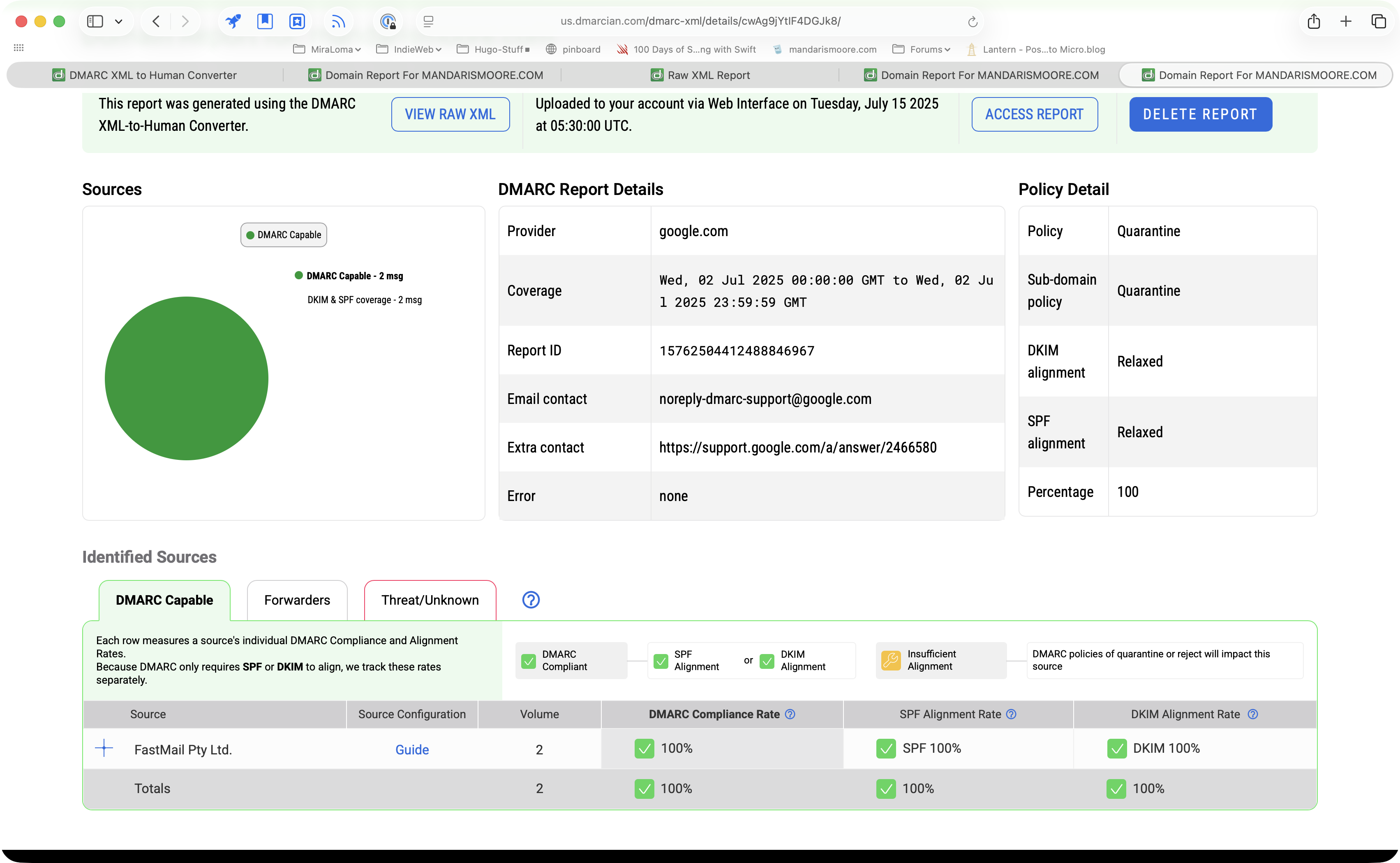
Static Structure

The resulting static HTML that I created to do my color styling looks similar to the following.

<aside class="admonition note">
  <header class="admonition-header">
  <svg
    xmlns="http://www.w3.org/2000/svg"
    width="24"
    height="24"
    viewBox="0 0 24 24"
    fill="none"
    stroke="currentColor"
    stroke-width="2"
    stroke-linecap="round"
    stroke-linejoin="round"
    class="icon icon-tabler icons-tabler-outline icon-tabler-note">
    <path stroke="none" d="M0 0h24v24H0z" fill="none"/>
    <path d="M13 20l7 -7" />
    <path d="M13 20v-6a1 1 0 0 1 1 -1h6v-7a2 2 0 0 0 -2 -2h-12a2 2 0 0 0 -2 2v12a2 2 0 0 0 2 2h7" />
  </svg>
  <h3>Note</h3>
  </header>

  <div class="admonition-content">
    Useful information that users should know, even when skimming content.
  </div>
</aside>

Styles and colors

For the initial implementation, I wanted to get the 5 states defined in the GitHub documentation which are note, tip, important, warning, and caution. This took longer than it should because I was having trouble deciding on what icon I should use for note and important because of the different samples I was pulling from contradict.

I placed static copies of the HTML in a page with the first line changed to the corresponding type as the class.

For example, the class for tip would look like this:

<aside class="admonition tip">

I then created a separate CSS file and linked it in the site header. I’m hoping that it will make things easier to find and modify styles in the future2. Since I’m working from Jinyi’s code as my base, I start off with the basic admonition and a note.

 1
 2
 3
 4
 5
 6
 7
 8
 9
10
11
12
13
14
15
:root {
  --admonition-color: var(--accent, #5e81ac);
}

.admonition {
  margin: 1em;
  padding-left: 0;
  
  border: 2px solid var(--admonition-color);
  border-left: 6px solid var(--admonition-color);
  border-right: 3px solid var(--admonition-color);
  border-radius: var(--border-radius, 1em);
  
  box-shadow: 0 2px 4px var(--admonition-color);
}
Line 2
I define the default color for the admonitions to be the accent color of my site with a default value in case someone takes this file and attempts to use it by itself.
Line 9-12
I use the --admonition-color to set the borders appropriately.
Line 14
I use a box-shadow to give the callout some depth.
 1
 2
 3
 4
 5
 6
 7
 8
 9
10
11
12
13
14
15
16
17
18
19
20
21
22
.admonition-header {
  padding: 0.5rem;
  display: flex;
  align-items: stretch;
  
  border-bottom: 1px solid rgba(0, 0, 0, 0.1);
  border-radius: 0 var(--border-radius, 10px) 0 0;
  color: var(--admonition-color);
  background: 
    color-mix(in srgb, currentColor, transparent 75%);
  
  svg {
    width: 1.1em;
    height: 1.1em;
    margin-right: 0.5rem;
  }

  h3 {
    color: var(--text);
    font-size: large;
  }
}
Line 7
Defines the upper right hand corner to be rounded to fit within the containing admonition. I attempted to use inherit but it wasn’t working.
Line 8
This is where the magic happens and we start seeing the Cascade portion of CSS. This makes the forefront/currentColor --admonition-color. This is used in fonts and any svgs that are in the header.
Line 10
I didn’t want to define two colors and found this tip on stack overflow to do a transparency translation of it.
Line 19-20
These are there to make some adjustments for contrast and size.

After that, I add a little bit of styling for the contents.

.admonition-content {
  padding: 0.5rem;
}

After that, we look at our base example.

Admonition undefined in lightmode.

Here it is without the rendering.

With this, I can change the color based off the alert.

.admonition.note {
  --admonition-color: #096ae1;
}

If I want to have the same color for multiple alerts, I can add an extra line for it.

.admonition.danger,
.admonition.warning {
  --admonition-color: orangered;
}

Implementing the Render Hook

I started with the example from the blockquote/alert documentation and I was really happy to know that it worked correctly by simply creating the file and putting the sample code in. Making the changes to the HTML tags was also pretty straight forward.

 1
 2
 3
 4
 5
 6
 7
 8
 9
10
11
12
13
14
15
16
17
18
19
20
21
22
23
24
25
26
27
28
29
30
31
32
33
34
35
36
37
38
39
{{- $icons := dict
  "caution"     "alert-triangle.svg"
  "idea"        "bulb.svg"
  "important"   "info-circle.svg"
  "info"        "info-circle.svg"
  "note"        "note.svg"
  "tip"         "bulb.svg"
  "warning"     "exclamation-circle.svg"
}}


{{- if eq .Type "alert" }}
{{- /* Render admonition. */}}
{{- $type := cond (index $icons .AlertType) .AlertType "info" }}
{{- $iconFile := printf "admonitions/icons/%s" (index $icons $type) -}}

<aside class="admonition {{ .AlertType }}">
  <header class="admonition-header">
    {{ if templates.Exists (printf "partials/%s" $iconFile) }}
    {{- partialCached $iconFile . }}
    {{- end }}
    {{- with .AlertTitle }}
    <h3>{{ . }}</h3>
    {{- else }}
    <h3>{{ or (i18n .AlertType) (title .AlertType) }}</h3>
    {{- end }}
  </header>
  {{- with .Text }}
  <div class="admonition-content">
    {{ . }}
  </div>
  {{- end }}
</aside>

{{ else }}
<blockquote>
  {{ .Text }}
</blockquote>
{{ end }}
Line 1-9
Create a dictionary to match which image goes to a specific image. Jinyi used the icon set from font-awesome so the names are not an exact match. I started off with just the basics and add info because I was working on this late at night and couldn’t remember if it was info or important that was part of the five initial alerts.
Line 12
The render hook will parse the different blocks of text and will set a flag on whether this block is an alert or not.
Line 14
Look in the dictionary for the alert type that was given by the user. If the alert type isn’t there, it will use info as the default. I decided that if I don’t have an icon in mind, I want it to show up as information to be given to the user.
Line 15
This specifies the path to the SVG that we’re going to use. I had attempted to use the method from Ronoe to load image from the assert directory but I didn’t understand the code at this point in time. I used a different variable for the file name because I didn’t want to confuse myself later on.
Line 17
Specify the alert type in the class list for the admonition to use the proper styling.
Line 19-20
Hugo loads the contents of the partial if it exist and puts it in the output. It’s a safe guard in case I add an image to the icons dictionary but don’t upload the file. In addition, there was a change to the templating system introduced in v0.146.0 that renamed partial to _partial. Be aware of that when implementing this on your own.
Line 22
Check if there is an alert title and place it in the heading on the following line.
Line 25
If the title isn’t there, we use the alert type for the heading. All the examples that I’ve seen also include the step of sending it through i18n for internationalization. One thing I noticed, is that it capitalized the alert properly before I created the associated translation file. I might just leave it that way because I’m currently the only one using this theme.
Line 28
This checks for the content of the alert and places it in a <div> for the admonition.
Line 35
If there isn’t an alert, text is processed as if it was a normal <blockquote> element.

Further callout options

After the initial creation of the render hook, I took some time away from the project. Some of the people that create content that I enjoy use Obsidian on a regular basis for writing and the ever growing list of what that application can do. Someone pointed out that there is a Callout Manager and the default has more than the list that I originally created. Other tools also have a wider assortment. I added a couple more to the dictionary, but I noticed that this would get tedious to add keys that would go to the same value. For example, in my list info and important use the same image.

So, after a little bit of trial and error, I was able to put together the following code block

1
2
3
4
5
6
{{- /* Define a list of keys that should share the same icon */ -}}
{{ $keys := slice "important" "warning" "error" }}
{{- range $keys }}
  {{- /* Merge each key into the dictionary with the same icon value */ -}}
  {{- $icons = merge $icons (dict . "exclamation-circle.svg") }}
{{- end }}
Line 2
Place the keys that I want to have the same image
Line 3
Tells go to loop through all the keys that are defined
Line 5
Creates a small dictionary with the key and the name of the image. Then it merges that dictionary with the icon dictionary and saves it.

I’m still a beginner at the go programming language and I don’t know if this is saving by value or reference. I also don’t know if this is more performant than having a longer dictionary with all the values. I’m hoping that the comments and this article helps me remember this the next time I want to add something.

Making it a little more accessible

During this development process, I noticed that one example would load the SVG and add aria-hidden="true" to make screen readers skip over the image without alternative text. I edited the SVG files that I use to have this additional line and played with the idea of adding aria-labelledby but I don’t have a way of reliably setting it and don’t know how this would improve the user experience.

The same example, also set the title, but I didn’t use this as this images are purely decorative. You can read this article about knowing the different use cases for aria visibility.

What’s the next step?

I feel the next step that I would like to pursue is to get get the colors to work better in the dark mode of my theme. I don’t feel that the contrast is good enough for warning and I’m thinking about moving to CSS colors such as blue or rebeccapurple instead of hexidecimal values. I’ve already done one like the following

.admonition.important {
  --admonition-color: light-dark(rebeccapurple, mediumorchid);
}

I’d also like to adjust the alignment of the icons. I don’t know if this is because I took the examples from different icons that are sized differently or if having the icon outside of the <h3> is causing more issues than it’s worth.

As always, I appreciate any feed back and I hope this article finds you well.


  1. By the time I got ready to publish this article, the site was no longer available. I’m hoping that it’s just a temporary shutdown until this person has the domain refreshed. ↩︎

  2. I have had to stop myself a couple times from trying to find the best way to deliver the HTML/CSS for this feature. Should I have separate files with style rules that I might not use or put it inline and worry that I might have an article that use dozens of these things? I feel shipping is more important. ↩︎

First Public Working Draft: YAML-LD 1.0

This looked interesting.

The logo for the W3 consortium.

The JSON-LD Working Group published today a First Public Working Draft of YAML-LD 1.0. [JSON-LD11] is a JSON-based format to serialize Linked Data. In recent years, [YAML] has emerged as a more concise format to represent information that had previously been serialized as [JSON], including API specifications, data schemas, and Linked Data.

I think it’s funny that we’re still looking into ways of writing data.

A threat model for accessibility on the web - Alice

This was an interesting article about accessibility and web standards. I feel that you are doing yourself a favor by putting the time to make your site as accessible as possible.

Accessibility is not alone in being a complex, highly specialised field, or even in being neglected.

One thing I really enjoyed about the article is the discussion about what things did not work and why.

Theme changes for November 4th, 2025

I had made a declaration about restarting theme development and I’m pretty happy to have finished it before my self imposed deadline. This is post is mostly about why I changed things versus how I changed them.

Changes to workflow

I spent some time experimenting with git and codeberg to see how I could integrate it with Micro.blog, but wasn’t successful. But, as James mentioned no work is wasted and I was able to take the research about multiple remotes.

git remote add lab-play https://github.com/mandaris/lab-play.git

Looking back, I probably should have made a different name and started the repository as empty versus having GitHub place some defaults that I had to --force to be overwritten.

Git flow chart that has one local repository connected to two remote destinations.
Multiple locations to push/pull from.

This allows me to branch, merge, and test on my test instance without worrying that I’ll mess up publish to the main site.

There was a significant amount of trial and error related to having to merge main into the two remotes, but it was mostly me having to learn the new tools.

Performance Tuning?

I removed the link to the tabler css file that would allow me to more easily use the font in my writing. I’ve decided that I’ll go through and just add the ones I specifically want for the interface. I feel that some people will probably use an rss reader and won’t be able to see the fonts anyway.

In addition, I used the font-display attribute for my font definition.

@font-face {
  font-family: "Atkinson";
  src: url("/fonts/AtkinsonHyperlegibleNext-Regular.woff2") format('woff2');
  src: url("/fonts/AtkinsonHyperlegibleNext-Regular.woff2") format('truetype');
  font-weight: normal;
  font-style: normal;
  font-display: fallback;
}

I choose fallback despite the recommendations to use swap or optional because I want the user to continue to read without the blip of the page being repainted to adjust for the new font.

I did not minimize the css or remove any classes other than accent-color. The place I was referencing it was marked as not having enough contrast. I’ll have to rethink this as it was there for decrotive purposes.

This is a good time to say that just because something is marked as an issue, it could be a false positive or a way to make something better. In this case, it’s better by not being there.

Where am I?

The moving of the About me section was the easiest part. I removed the media query section in css that would place the section to the side on larger screens. I then made the width larger of the initial 1 column layout.

grid-template-columns: minmax(300px, 75ch);

I choose 75ch because my research had stated that between 70 to 80 characters was the ideal line limit for reading. If you see something different let me know.

What about the transition?

I’m still working on that. Part of me wants to throw my hands in the air state that it’s just bugginess from it being a new thing, but I think it might be because the URLs on the server end with .html and my local instance has /.

I’ll continue working on this throughout the month.

Various other tweets

I made the h1 smaller in order to reduce focus on it. I really want people to come into the site and just start reading the content. That’s part of the reason I moved the About me section.

I also removed some of the links at the top of the page. I’ve been debating a hamburger menu, but have decided against it because I don’t want navigational items to be hidden from the user.

Pretty much the opposite of Liquid Glass.

Restarting Theme Development

This post is a bit of a ramble and more for documenting my thinking.

Things have been kind of hectic in my personal life and I’ve been taking a step away from creating and interacting. In the time that I’ve been away, there have been changes to Hugo and the Micro.blog. In some ways, it’s been a relief that Micro.blog is using v0.117. Other than the changes in v0.132 (The introduction of alerts although v0.140 and v0.142 has some significant fixes to this), I haven’t really seen anything catches my interest.

Still, I have seen some interesting things being done with blogs and want to be able to take advantage of the newer versions of Hugo when Manton and crew make it available.

I thought I would document what steps I went through. I’ve begun writing this on September 24th and worked on it in my spare time until clicking the publish button.

Environmental Setup

At the beginning of this process, I had Hugo v0.146.3 installed on my MacBook Air running Tahoe 26.1. I want to be able to test in different versions of Hugo so did a search and found several article pointing to hvm (Hugo Version Manager). The tool was created by Joe Mooring who is very active on the Hugo Forums and you can go to the GitHub repository to review the code.

The first thing I did was use Kostas’ instructions for using brew to get a certain version of running a specific version of Hugo and then I downloaded the v.117 hugo ruby installer.

That didn’t work.

So, I downloaded the homebrew-core from the GitHub repository and then changing to the commit that has the version I want.

git checkout e243fd4

That didn’t work for me as well and I grew tired of trying to find the right combinations of brew commands.

So, I followed the directions and ran the next step to see an error

mandaris@skylite ~ % hvm gen alias --help
zsh: command not found: hvm

That’s when I realized that my system is almost a clean install other than the installation of the command line tools and brew, I didn’t have things like /usr/local/bin or anything else that I had taken from granted in my previous setup.

I set up oh-my-zsh and kept the defaults. I forgot why I use this but not how. I added the following to my .zshrc

export PATH=$PATH:$(go env GOPATH)/bin

Then new shell instances will be able to find the executables from GO.

➜  ~ which hvm
/Users/mandaris/go/bin/hvm

When I ran it the first time, I didn’t see my option and asked on the forums before I went through the associated documents to see that I could add the specific version to a .hvm file that I can put in the root of the folder I’m working with.

➜  local-hugo hvm status
The current directory is configured to use Hugo v0.117.0.
Cached versions of the Hugo executable:

v0.151.0
v0.117.0

Now I’m able to switch between the versions easily.

The only problem is that some of the plugins that I use locally are not compatible with that version. For example, the stoot plugin to embed mastodon post.

Hashtag Goals

Other than the work to keep the theme ready for newer versions of Hugo, I’ve identified a couple other things that I want to work on.

  1. Increase the performance of the site
    I don’t want to remove styling or minimize the file because I feel that it will help others learn and I’m too afraid to kill my darlings.
  2. Move the About me to the bottom
    I feel having it on the side on larger screens draws focus away from the writing on page.

In addition, I have to figure out why @view-transition doesn’t work on the server but works on my local copy of the site.

The goal is to get this all finished before Thanksgiving break. So if you’re reading this please feel free to bug me about it as my self imposed deadline draws near.

Take Care!

Creating Perfect Font Fallbacks in CSS | Aleksandr Hovhannisyan

I've been thinking about this article by Jim Mitchell on using Phosphor Icons for Micro.blog navigation but haven't finished implementing it with my preferred icon font, tabler.

I was researching what would happen if someone was to read the site and the font is not available – for example, RSS – when I came across a post talking about descent-override.

While font metrics are baked into a typeface’s definition, there are various CSS properties that allow stylesheet authors to override those metrics. Among them, the three most important ones that we’re interested in are size-adjust, ascent-override, and descent-override.

I’ve currently have a small selection of fonts being referenced, to verify for myself that the font isn’t downloaded when not used. I want to make this a two step rollout as I redo my page navigation and change the spacing in the articles.

Be sure to check out Jim’s blog for lots of great content!

Give footnotes the boot - JakeArchibald.com

I've been thinking about footnotes and whether they should be included in my writing. It started after reading this article from Kitty Giraudel about accessible footnotes, and I explored using popover as an alternative.

I was reading the Piccalilli newsletter and saw that Jake Archibald recently wrote an article about footnotes and has some suggestions on what to use instead.

I hate footnotes1, and hopefully by the end of this, you will too. Let's get down to it…

One of the points that stuck out for me was how footnotes can lead to context switching which can interrupt the flow of reading.

I’m still using footnotes in my writing, but I’ve (hopefully) reduced the usage to references.

Be My BIMI

A beaker with water and a smile

I’ve been curious about how images and logos show up in my mail client even when I do not have them in my address book. I thought I would look into this as a small side project before I rewrite the author information on the site1.

So, the question is, “How do I do this?”

Answer, I can’t.

Well, not officially.

The images that you see next to your email are called BIMI, Brand Indicators for Message Identification. To more reliably use this, I would need to make my icon a registered trademark for more service providers. But, I noticed that Fastmail allows it, and I use that service for my email. So, I’m going to do all the other steps associated with the process.

Step 1: Get/Set the DMARC Record

I currently use Hover as my domain registrar, and they have an interface that allows me to set a DMARC record. I used the wizard from DMARC.com, but it’s essentially a text string that you can just add.

For me, I used specific email under my domain so that I could filter things related to this process.

v=DMARC1; p=quarantine; rua=mailto:dmarc@mandarismoore.com;

The p=quarantine is key to making sure that the record is handled correctly for this particular iteration.

Step 1.5: Reconfigure the SPF

When I configured FastMail as my email host, it had specified an option in DNS for SPF, Sender Policy Framework.

FastMail has SPF configuration documentation to use the ?all directive for configuration.

v=spf1 include:spf.messagingengine.com include:spf.example.com ?all

From what I can see, it seems like there is a problem if an email that I send is forwarded to another server. I’ve decided to use the ~all for now.

I don’t send out that many emails, and I’m growing more and more… cautious on where my email might be going.

Step 2: Configure the Image Correctly

I think this is the step where I got the most value out of this process, because it had me re-evaluate the SVG that I’ve been using for my website. When I used Real Favicon Generator to create the .ico file and manifest for the site, I used the svg that was also created. It looks the same, but the internal structure is different from the original. The site claims that the one it generates is future proof.

I switched back to the original for the SVG and used the SVG Conversion Tools to create a version of what this is expecting. As a bonus, I add the same title and desc fields to the SVG that I serve.

I then added the BIMI to the site and made sure that the file address is reachable.

I added the TXT record for the BIMI and let it propagate.

Step 3: Register your Trademark

This is a step that I didn’t look into in depth. To register my trademark would cost me $75 dollars in the state where I live, and I don’t know if that would be honored internationally.

I cannot justify the expense of having my icon show up in the emails of people who may never read or care.

I mean, I care, but that brings up another point.

Gravitar should work

Gravitar is a free2 service that acts as a way to validate and host information about who someone is. Other services can query gravitar to look up information about that user. For example, if I sign up for a new discourse forum, it will take my email and use the profile picture that gravitar has on file and use that until I tell the forum to use another picture.

It’s very convenient, and I’ve enjoyed seeing the same people in different communities that I go to.

The only problem that I’ve come across is that it caches the picture that you have when you first sign up to the service.

Conclusion

I set this up, but I do not truly know if it works. I’ve tested with DMARC Domain Checker and ValiMail Domain Checker, and it looks like everything is working with the current ~all and p=quarantine options.

DMACian also has a DMARC Report Analyzer that can give you an idea of what issues you might have when you configure this.

DMARC report showing no errors.
It is good that the one email I send out a week was not rejected.

I’ll make the switch to the more secure settings after this is published. You can email me if you want to get an email to check if it’s working.


  1. I do not know why I want to do this. It seems to be working just fine and the only thing reading the information will be bots. ↩︎

  2. The service is offered by Automattic. The CEO has been part of some online drama with WordPress. This causes me to feel a little uncertain on what is going to happen with this in the future. ↩︎

The Mathening

Teacher pointing at whiteboard

I’ve been thinking about writing a post about math (or maths) for months after hearing about if from Fractal Kitty and her passion for Mathober.

(Un)fortunately, I don’t have any math specific topics that I want to discuss, but I’m not happy with just sitting on an idea when I can share it with you all in case you need it1.

Resources

Math in Style
This is my favorite tip about math in the browser. Sarah has several posts about styling math and I encourage you to check it out. I had no idea that this existed and I feel that if you take anything from this post, it should be this. I think this is a great alternative to including something like MathJax.
Math to MathML
This is a really cool tool to help get functions into MathML for the site. It also does LaTex if that is what you need.
MDN: Math
While you’re looking over the Mozilla documentation, think about giving a donation so that this resource can continue being.

  1. For those who are curious, I haven’t added it to my style sheet for this site yet. It’s a sort of chicken-and-egg issue. ↩︎

Share the Love

People sharing something
Remember when the internet was about sharing cool things?

I like sharing memes and articles with my friends. I also like saving links to things that I read so that I can follow up with them later. I wanted to make it easier for me to share links to my page and document how I integrated it into the theme that I’ve been working on.

Resources and History

I’ve used plenty of great examples that I’m going to list below. I would not have been able to make this possible without learning from these write-ups. I hope that you check them out for any details that I may have missed or chosen to implement differently.

Simplify sharing with built-in APIs and progressive enhancement - Piccalilli
This article written by Andy Bell is where I’ll be getting most this text from. I’ll do my best not to make this a copy of what he has and encourage you to follow the people at piccalil.li because they have some great content.
How to let the user share the website they are on - web.dev
This article by Thomas Steiner is also pretty good and shows how you can have OS-based share icons. I’ve planned to go back and add icons on the buttons sometime in the future.
An advanced guide to the Web Share API and navigator.share() - LogRocket Blog
A great read by David Omotayo. This one has little videos that show you what is going on as you move through the process of adding this functionality.
How to Use the Web Share API - CSS-Tricks
Ayooluwa Isaiah has a nice article on CSS-Tricks.
Web Share API - Web APIs - MDN
And it’s always good to check out what MDN has to say about this. This has a very basic example and a browser compatibility chart.

I’ll be adding the sharing and clipboard functionality by having an optional section that Matt Langford showed me how to create a while ago.

The Buttons

My first steps were to make sure that the buttons would fit in with the rest of the theme. Instead of having a picture, I thought it would be better to add the buttons below so you can see what they currently look like.

I added the following CSS to remove the default styling that is given to <button> elements in CSS, and then added the element to the definition of what I call a lozenge.

 1
 2
 3
 4
 5
 6
 7
 8
 9
10
11
12
13
14
15
16
17
18
19
20
21
22
23
24
25
26
27
28
29
30
31
32
input, button {
  -webkit-appearance: none;
  -moz-appearance: none;
  appearance: none;
  border: none;
}

...

button,
.lozenge {
  background-color: var(--accent-alt);
  color: var(--nordDark1);
  text-decoration: none;
  text-align: center;
  display: inline-block;
  filter: drop-shadow(0.1rem 0.1rem 0.1rem);
  padding: 0px 12px;
  border-radius: 1em;
  line-height: normal;
  cursor: pointer;
}

...

button:not([disabled]):hover,
.lozenge:hover,
.lozenge:focus-visible {
  color: var(--nordLight3);
  background-color: var(--accent-opposite);
  filter: drop-shadow(0.1rem 0.1rem 0.1rem);
}

Safari seems to have some issues when hovering over the button. I suspect that it has something to do with the combination of filter and borders. I’ve decided that I’ll come back to it at a later date.

Next, I added a partial called share-actions.html to the theme in the plugin-container aside found in single.html. This means that I have to address a feature that I put in the template to hide this element if it didn’t have a set of different elements. I have written about it in a post called Labarum: Can I has Cheeseburger and Debugging.

1
2
3
4
5
6
7
8
9
.optional {
  display: none;
}

.optional:has(a, p, img, button) {
  display: block;
  text-align: center;
  grid-area: informational;
}

I added button to the list of items in order to get this working.

I then added two buttons to the partial that I created as a proof of concept that it’s working at this point.

The JavaScript

This is the first time that I’ve worked with webcomponents and probably would not have used them if the example that I was copying being inspired by didn’t have step-by-step instructions.

I changed the contents of share-actions.html partial to match up with the tutorial except for a little bit of wording and using the Hugo variables to populate the values as seen below.

<share-actions>
  <p>Copy this link to share.</p>
  <p><a href="{{ .Permalink }}">{{ .Permalink }}</a></p>
</share-actions>

I then create the file static\js\share-actions.js to put the logic that we going to use and then paste the javascript from the tutorial. Furthermore, I then added the following line above to link to the javascript.

<script async type="text/javascript" 
    src="{{ "js/share-actions.js" | relURL }}">
</script>

The script is small, but I don’t want it to slow down the rendering of the page so I use the async keyword. I use Hugo’s way of referencing the script and have placed it in the page instead of the head in the hopes that it’s only loaded when needed.

After this, the page renders to buttons properly and the functionality is complete.

Links and buttons with different styling
The tutorial places the buttons in an unordered list which makes the buttons not flow properly.

Unfortunately, the buttons do not fit into the rest of the theme. I want the buttons to flow with the links that are created via Micro.blog plugins. This means removing the <ul> and <li> tags around the buttons. This causes other problems, as the code is written to have a <div> become visible to alert the user that something has happened.

I spent a lot of time trying to understand position: fixed and going back and forth over when and where things should show up when I remembered that I had spent a lot of time working on trying to make popovers1 work with the theme and that might be a better solution.

So, I changed the inserted HTML to the following.

<button class="button" data-method="share">
     Share
</button>
<div role="alert" popover></div>

This allows me to go over the notes that I put together for my experiment with popovers last year.

I then changed the code from adding and removing the text to toggling the popover to show and hiding.

 1
 2
 3
 4
 5
 6
 7
 8
 9
10
11
12
13
14
renderAlert(text, context, clearTime = 3000) {
    const alert = context
      ? context.nextElementSibling
      : this.querySelector('[role="alert"]');

    if (alert) {
      alert.innerText = text;
      alert.showPopover();

      setTimeout(() => {
        alert.hidePopover();
      }, clearTime);
    }
  }
Line 4
This line is directly from the tutorial. I highlighted it here because I was looking at a popover tutorial that had javascript examples, and I was thinking about using document.querySelector('[popover]') in order to get the reference to open and close. This would allow me to define the popups outside of the javascript and have Hugo place information about the document. I decided to revisit this idea at a later time.
Line 8
Shows the popover. It’s a light-dismiss popup so the user can click anywhere and the button should go away.
Line 11
Closes the popover after time set by clearTime. I wanted to make sure not to use .togglePopover() as this might reopen the popover if it was dismissed by the user.

Styling the Popup (again)

I took what I had done from the previous work on popups and read over Animating dialog and popover elements with CSS @starting-style and How to Create Native Popovers in HTML Without JavaScriptof the tutorials that had come out since that time.

 1
 2
 3
 4
 5
 6
 7
 8
 9
10
11
12
13
14
15
16
17
18
19
20
21
22
23
24
25
26
27
28
29
30
[popover] {
  margin: auto;
  padding: .5rem;
  border-radius: var(--border-radius);
  background: var(--accent-alt);

  transition: all 0.25s allow-discrete;
  opacity: 0;
  translate: 0 2em;
}

[popover]::backdrop {
  backdrop-filter: blur(3px);
}

[popover]:popover-open {
    top: 2rem;
    opacity: 1;
    translate: 0 0;
}

@starting-style {
  [popover] {
    &:popover-open {
      top: 2rem;
      opacity: 1;
      translate: 0 2em;
    }
  }
}
Line 7-9
This defines the animation of the popover and uses the new keyword of allow-discrete.
Line 13
This blurs the background as the popup shows up. I might also darken it slightly at a later date.
Line 22
My understanding is that this defines the first frame or what the initial state of these objects within it is supposed to be.

I don’t have much for this section as it was mostly trial and error as I tried to get it working in a way that I like.

In conclusion

I hope that you take this example and make something more with this. I’ve got about two dozen tabs open in order to get all the examples I needed in order to understand and then write this post.

It haunts me.

If this helps you in any way at all, I’d love it if you’d drop me a line.


  1. Forgive me if I switch back and forth from popover and popup. I first learned about these in the early 2000s when they were annoying ads that took up bandwitdth and screen real estate. Popup blockers where needed in order to browse some parts of the web. ↩︎