 Mandaris
I like sharing memes and articles with my friends. I also like saving links to things that I read so that I can follow up with them later
. I wanted to make it easier for me to share links to my page and document how I integrated it into the theme that I’ve been working on.
Resources and History
I’ve used plenty of great examples that I’m going to list below. I would not have been able to make this possible without learning from these write-ups. I hope that you check them out for any details that I may have missed or chosen to implement differently.
- Simplify sharing with built-in APIs and progressive enhancement - Piccalilli
- This article written by Andy Bell is where I’ll be getting most this text from. I’ll do my best not to make this a copy of what he has and encourage you to follow the people at piccalil.li because they have some great content.
- How to let the user share the website they are on - web.dev
- This article by Thomas Steiner is also pretty good and shows how you can have OS-based share icons. I’ve planned to go back and add icons on the buttons sometime in the future.
- An advanced guide to the Web Share API and navigator.share() - LogRocket Blog
- A great read by David Omotayo. This one has little videos that show you what is going on as you move through the process of adding this functionality.
- How to Use the Web Share API - CSS-Tricks
- Ayooluwa Isaiah has a nice article on CSS-Tricks.
- Web Share API - Web APIs - MDN
- And it’s always good to check out what MDN has to say about this. This has a very basic example and a browser compatibility chart.
I’ll be adding the sharing and clipboard functionality by having an optional section that Matt Langford showed me how to create a while ago.
The Buttons
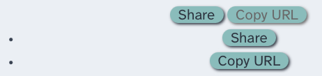
My first steps were to make sure that the buttons would fit in with the rest of the theme. Instead of having a picture, I thought it would be better to add the buttons below so you can see what they currently look like.
I added the following CSS to remove the default styling that is given to <button> elements in CSS, and then added the element to the definition of what I call a lozenge.
|
|
Safari seems to have some issues when hovering over the button. I suspect that it has something to do with the combination of filter and borders. I’ve decided that I’ll come back to it at a later date.
Next, I added a partial called share-actions.html to the theme in the plugin-container aside found in single.html. This means that I have to address a feature that I put in the template to hide this element if it didn’t have a set of different elements. I have written about it in a post called Labarum: Can I has Cheeseburger and Debugging.
|
|
I added button to the list of items in order to get this working.
I then added two buttons to the partial that I created as a proof of concept that it’s working at this point.
The JavaScript
This is the first time that I’ve worked with webcomponents and probably would not have used them if the example that I was copying being inspired by didn’t have step-by-step instructions.
I changed the contents of share-actions.html partial to match up with the tutorial except for a little bit of wording and using the Hugo variables to populate the values as seen below.
<share-actions>
  <p>Copy this link to share.</p>
  <p><a href="{{ .Permalink }}">{{ .Permalink }}</a></p>
</share-actions>
I then create the file static\js\share-actions.js to put the logic that we going to use and then paste the javascript from the tutorial. Furthermore, I then added the following line above to link to the javascript.
<script async type="text/javascript"
    src="{{ "js/share-actions.js" | relURL }}">
</script>
The script is small, but I don’t want it to slow down the rendering of the page so I use the async keyword. I use Hugo’s way of referencing the script and have placed it in the page instead of the head in the hopes that it’s only loaded when needed.
After this, the page renders to buttons properly and the functionality is complete.
Unfortunately, the buttons do not fit into the rest of the theme. I want the buttons to flow with the links that are created via Micro.blog plugins. This means removing the <ul> and <li> tags around the buttons. This causes other problems, as the code is written to have a <div> become visible to alert the user that something has happened.
I spent a lot of time trying to understand position: fixed and going back and forth over when and where things should show up when I remembered that I had spent a lot of time working on trying to make popovers1 work with the theme and that might be a better solution.
So, I changed the inserted HTML to the following.
<button class="button" data-method="share">
     Share
</button>
<div role="alert" popover></div>
This allows me to go over the notes that I put together for my experiment with popovers last year.
I then changed the code from adding and removing the text to toggling the popover to show and hiding.
- Line 4
- This line is directly from the tutorial. I highlighted it here because I was looking at a popover tutorial that had javascript examples, and I was thinking about using
document.querySelector('[popover]')in order to get the reference to open and close. This would allow me to define the popups outside of the javascript and have Hugo place information about the document. I decided to revisit this idea at a later time. - Line 8
- Shows the popover. It’s a
light-dismiss
popup so the user can click anywhere and the button should go away. - Line 11
- Closes the popover after time set by
clearTime. I wanted to make sure not to use.togglePopover()as this might reopen the popover if it was dismissed by the user.
Styling the Popup (again)
I took what I had done from the previous work on popups and read over Animating dialog and popover elements with CSS @starting-style and How to Create Native Popovers in HTML Without JavaScriptof the tutorials that had come out since that time.
|
|
- Line 7-9
- This defines the animation of the popover and uses the new keyword of
allow-discrete. - Line 13
- This blurs the background as the popup shows up. I might also darken it slightly at a later date.
- Line 22
- My understanding is that this defines the first frame or what the initial state of these objects within it is supposed to be.
I don’t have much for this section as it was mostly trial and error as I tried to get it working in a way that I like.
In conclusion
I hope that you take this example and make something more with this. I’ve got about two dozen tabs open in order to get all the examples I needed in order to understand and then write this post.
It haunts me.
If this helps you in any way at all, I’d love it if you’d drop me a line.
-
Forgive me if I switch back and forth from popover and popup. I first learned about these in the early 2000s when they were annoying ads that took up bandwitdth and screen real estate. Popup blockers where needed in order to browse some parts of the web. ↩︎