Tuesday, I released a post with and version bump of Labarum. I then went on and recorded a podcast stating that theme was now “feature complete”.
Well, I was wrong.
I went to the Homebrew Website Club to do some socializing and shared my site with the others. I pride myself on having a site that is pretty accessible. Turns out that the color contrast on my links isn’t good enough. I knew I had tested the basic font, but had misattributed the links not passing the contrast test as an issue with the test itself.
Definitely, I needed an intervention.
So, I spent about an hour going through all the accessibility issues and HTML validation errors. Some of them I can’t change at this time because the code is generated by Hugo/Goldmark. For example, if you have multiple articles on a page (index or list) and they each have a set of footnotes or use a table of contents, you will get an error about them using the same ids for those items.
I’m not going to put the time or energy into that.
Other issues such as a warning about using a trailing slash in the HTML did make me pause for a moment. For example the following from site-head.html:
<imgsrc="https://cdn.uploads.micro.blog/661/2023/children-who-are-wrong.jpg"alt="Principal Skinner thinks the children are wrong"title="Self Reflection can be hard."/>
I decided to keep examples like these and ignore the issue for now.
Other accessible issues that I’m not going to put more energy into at this point are the code blocks. Some of the contrast colors for keywords were flagged, and the tabindex="0" can make keyboard navigation more difficult than it needs to be.
The most egregious issue is that I use the colors in the headers and links at the very top of the page. I’ve since changed it in both light and dark mode to be something closer to the basic font color but still within the Nord color scheme.
Since I’m changing the colors, I’ll have to redo the images that I have in the README.md which will probably make me think of other things to change. I’m both dreading and excited by doing that as I’ve learned more about what makes for a good demonstration of Labarum.
What is the next opportunity for Labarum?
My favorite part about this post and this point release is that I’m writing about what I’m not going to do.
Sure, there are places that the theme needs improvement1, but I have never been more confident and happy with where it is. I looked at the git history and the first commit was February 21st, 2022. That’s a significant amount of time.
I want to spend more time putting stuff on the blog and less time on what it looks like.
There are going to be changes in the future.
But at this point, it will be focused on changes that are related to the content that I’m creating.
I will not mention them in this post. As always, I’ll make note of any imput. ↩︎
One of the changes that version .117 of Hugo that has been allowed onto Micro.blog is the ability to use diagrams in your markdown. The documentation on diagrams highlights two different kinds of diagrams that you can include; GoAT and Mermaid.
When you make a diagram using GoAT, Hugo translates this into a SVG on the server side and then delivers it with the HTML for that particular post. You can find some really complicated examples of them on the GitHub page for GoAT and I’ve included one below to demonstrate.
Mermaid is a diagramming and charting tool that uses javascript and will load different libraries as needed to create the final product. I believe that it can be used to make static deliverables that you could save, but -according to my understanding- that’s a separate module and outside what Micro.blog and most installations require.
In addition, Hugo does not include the connections to Mermaid, and it’s up to the theme developers to make sure this works.
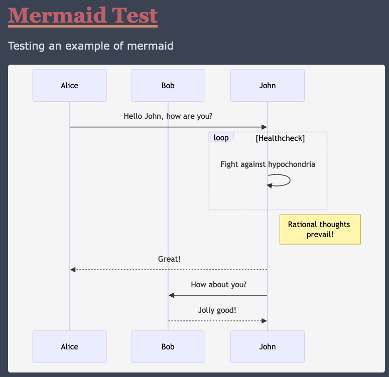
When you get it working, you can have diagrams like the one below.
sequenceDiagram
    participant Alice
    participant Bob
    Alice->>John: Hello John, how are you?
    loop Healthcheck
        John->>John: Fight against hypochondria
    end
    Note right of John: Rational thoughts
prevail!
    John-->>Alice: Great!
    John->>Bob: How about you?
    Bob-->>John: Jolly good!
The Mystery of the Mermaid
I had to ask myself why am I putting the time into getting this feature working in my theme. At first glance, the goals of accessibility and speed do not seem to align with adding diagrams built with third party JavaScript framework. I’ve run this site for years and have used tools to create static images that I serve with alt text to illustrate my point.
Ultimately, it’s because I love DIAGRAMS!
I like being able to have a picture that goes with my posts. I don’t feel that I will be using a lot of these, but I want to help those who do.
And with all of my labarum posts, feel free to take what you want to make your themes better.
Splashing around with the Mermaid
I want to start off this section by stating that a lot of what I’m going to write about is duplication of the documentation found online. This is me documenting my process of applying it and my thought process at the time.
My first stop on implementing this is to open up a browser window to duckduckgo and then opening the first 3-5 search results of Hugo mermaid diagram from DuckDuckGo before reading the Hugo Mermaid documentation. I do this to get a feel of what developer roadblocks and experiences that I can note before reading the documentation. It’s similar to where I would read the discussion questions the teacher gives for assigned reading back in school.
The step of creating the layouts/_default/_markup/render-codeblock-mermaid.html is straight forward1.
The first line will go to the resultant HTML, and mermaid will look for items that have the mermaid class to get instructions on what kind of image needs to create.
The second line passes whatever was in the code block. This is typically the definition of the diagram but if you are more familiar or more adventurous you can pass mermaid directives or configurations as well.
The next step is to add something similar to the template.
I wasn’t sure why this needed to go on the actual page versus on the footer that would be used on every single page of the website. Most of the examples that I looked at had it on the single.html and this worked for individual pages but not for the index.html.
I placed it in article_footer.html until I get a deeper understanding of how Hugo wants to manage a flag that would toggle the loading of JavaScript.
Luckily, the browsers that I tested with only load the JavaScript once. I’m not a JavaScript expert, but I think multiple loads of the 7k line file might be frowned upon.
Colors of the Mermaid
After I got it working for the index and standalone pages, I tested the diagram with the dark mode of the theme. Unfortunately, the default text color does not work in all situations.
I checked the documentation on theming the diagrams and saw that I can change the theme by giving it as a parameter during the initialization of mermaid.
This allows for the diagrams to look good in dark mode.
This looked good in dark mode but not light mode.
I then experimented with changing the background for div.mermaid and then having the diagrams render using the default theme for both light and dark mode.
Good but not ultimately it just didn’t look good enough. I showed it to my wife and some people in a discord and they agreed as well.
I needed to find a way to make it toggle from default and dark.
Line 6 is the beginning of a JavaScript Object. I feel that the way it’s in the theme will make it easier to maintain and extend in the future.
It’s all about that base
Mermaid does have a base theme that allows for you to define the colors for the diagram. Yes, I could have taken the time to learn how to pull colors from the theme or use the toggle from light and dark mode to set the diagram colors. But, that could be a long process to customize something that I may not use.
If you want to take this theme and approach, please do, and please have no hesitation to send me a link of your endeavors.
Limitations
Although this implementation does consider if the user is in light or dark mode, it does not switch dynamically. If you are on a system that changes the theme depending on time, you will have to reload to get the different theme. There are themes and walk throughs that show how to do this, but I feel that this iteration and my skill level are not at the appropriate level to implement it now.
Another limitation is that the diagram definition might find it’s way into the .Summary for the individual post.
Mermaid Treasure
Thank you for getting this far into my post. Here are some resources if you want to know more about Mermaid.js.
A quick way to make and test your diagrams before putting them in your posts.
What’s next for Labarum?
I need to do an accessibility and validation audit of the theme. I’ve been making some adjustments and haven’t been testing to make sure that the site is as accessible as I had originally intended.
I’ve found other templates that will have this call a short code that takes a set of parameters that control alignment and zoom of the diagram. I have no plans on duplicating that kind of functionality at this time. ↩︎
I’m rolling out another update to my theme for Micro.blog. It took a lot of time and effort on my part. It definitely reminds me of the story about how people paint both the front and back of a fence. I don’t think most will know or use some of the things that I put into this. If you do use or learn anything from this, I would really appreciate you sending me a message.
I’ve been doing small tweaks to the theme for the last couple of weeks as I learn more and more about CSS. I had even posted about how I had started working through the material found in Kevin Powell’s Conquering Responsive Layouts course and got a couple of responses that pointed me to further research.
There are plenty of miscellaneous changes that I put in related to accessibility and edge cases for HTML elements.
Back on the (code) block
I’ve been working on code blocks for a while. I don’t think there are many blogs on micro.blog that feature code as a regular part of what they publish. It’s very important to me that as someone who is writing about the code of the theme that it can be read.
It haunts me.
I was ok with the fact that the code blocks worked well with Hugo version .91 but, with the availability of .177, I couldn’t ignore the problems that I saw.
The underlining issue is that the default properties for the theme and Hugo is to place the styling inline of the HTML. AND, that I’ve opted to use display: inline-block for the <div> that is the container for my blog posts.
To better explain the issue, I’ll use the following snippet found in the Hugo documentation about code fences and put it in one of my posts, I’d get different results based on the version of Hugo that I’m running.
```go {linenos=table,hl_lines=[1,11,"15-16"],linenostart=199, anchorlinenos=true, lineanchors=small }
// GetTitleFunc returns a func that can be used to transform a string to
// title case.
//
// The supported styles are
//
// - "Go" (strings.Title)
// - "AP" (see https://www.apstylebook.com/)
// - "Chicago" (see https://www.chicagomanualofstyle.org/home.html)
//
// If an unknown or empty style is provided, AP style is what you get.
func GetTitleFunc(style string) func(s string) string {
  switch strings.ToLower(style) {
  case "go":
    return strings.Title
  case "chicago":
    return transform.NewTitleConverter(transform.ChicagoStyle)
  default:
    return transform.NewTitleConverter(transform.APStyle)
  }
}
```
Hugo will render this as a series of nested spans in a table in a couple of divs. For example, the span that contains the line number would be div.highlight > div > table > tr > td:first-of-type > pre > code > span.
Each level of this structure may have its own inline styling.
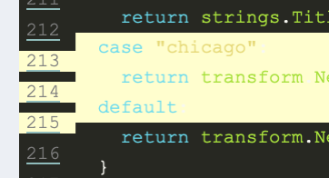
Going back to the code snippet, with version .91, I would get the following output for the highlighted line 213 (the one that with ‘case “go”’). I changed the spacing for legibility.
Note that this version allows use to set anchors for the individual lines as well as a prefix.
At this point, I realized that I needed to have a better way of controlling the behavior of the different elements. Luckily, the documentation for Hugo Highlighting configuration has a noClasses flag that we can set in the config.json of the theme.
With the noClasses set to false1, the line that we’ve been looking at gets rendered to something like below.
The example is legible without the color and inline formatting.
To put the color back into the example, we refer to the documentation on how to generate syntax highlighter CSS to get the colors. I used the example that they provided so that I could compare it to the defaults.
hugo gen chromastyles --style=monokai > syntax.css
Then we add the newly created css file to our site-head.html to represent that syntax color is important but that the style.css is the final say for customization from the theme.
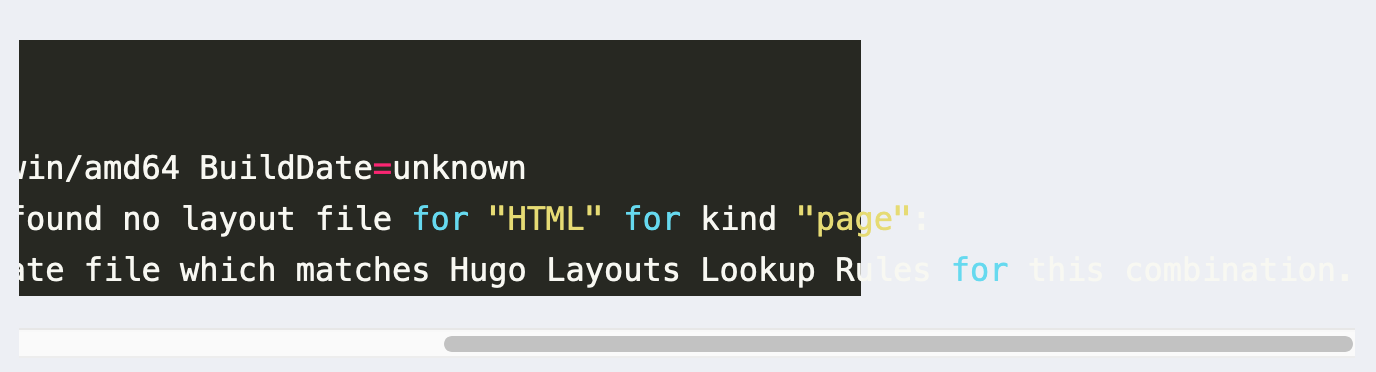
Unfortunately, the lines to do not … um… line up and the colors don’t match up with what we’re expecting.
Highlights not lining up for code blocks
After some experimenting with Firefox developer tools, I added the following to the style.css to get the lines to match.
The color for the highlight appears to be incorrect for all the styles that I tested, so I went back to an earlier version of Hugo to get the color and then placed it in the style.css as well.
// GetTitleFunc returns a func that can be used to transform a string to// title case.//
// The supported styles are//
// - "Go" (strings.Title)// - "AP" (see https://www.apstylebook.com/)// - "Chicago" (see https://www.chicagomanualofstyle.org/home.html)//
// If an unknown or empty style is provided, AP style is what you get.funcGetTitleFunc(stylestring)func(sstring)string{switchstrings.ToLower(style){case"go":returnstrings.Titlecase"chicago":returntransform.NewTitleConverter(transform.ChicagoStyle)default:returntransform.NewTitleConverter(transform.APStyle)}}
You can also link directly to lines (for example, line 213) and it should work. It also scrolls side to side to accommodate the longer lines.
Showing the table of contents
When I get frustrated with code blocks, I look at other aspects of the theme and what’s available in Hugo and Micro.blog. Hugo offers built in table of content short code that can be used in the themes. You can read more about it in the online documentation.
My first idea was that I wanted to have a property that users could turn on to automatically add the table of contents to a post. I came across this feature in the Cards Theme for Micro.blog and thought that it would be a nice feature for those who write a long post.
I create _partial\toc.html with the following code that I would put above the <div> that that contains the contents of an individual post.
Line 2 makes the default state of the table of contents hidden and then line 7 checks to see if Hugo has rendered a <ul> within whatever is in the .TableOfContents class. If it’s true, then line 8 will set the display type to a block; making it visible.
Problem Opportunity
Unfortunately, I ran into a number of issues.
It does not take into account older posts that already have table of contents
Most of my posts about labarum have headers and I do not want to go back and edit all of them. Some users might only want a table of contents that they specify themselves.
It obscures posts that start off with a big “hero” image
I have a couple of posts like this and the floating of the table of contents did not look correct. I will have to come back to this when I’m a little better with CSS.
This technique does not currently work with Firefox
The table of contents does not show up on Firefox. I tried experimenting with different logic to toggle the visibility, but ultimately, I couldn’t get it working. I don’t know how many people are using this theme or how many people come to my site using Firefox, but I really, really want people to be able to read this. NOTE: I wrote this on August 20th, and then the Firefox nightly build enabled the :has flag in build 119. Meaning that this will work soon.
I decided to remove the property and make two different shortcodes for table of contents.
The first one is activated by adding {{ toc }} to your text and will float in the center of the article.
The second one is activated by adding {{ floating-toc }} to your text and will float in the right of the article.
Please note that if you place the short codes at the beginning of the post, it will be part of the .summary.
There were a couple of things that I wanted to add to this release but realized that I was stopping progress. In my last two posts about labarum, I told myself that I wouldn’t wait for perfection to happen.
That being said, here are the things that I have on the roadmap for my next release.
Show the Profile Picture
A couple of the other themes on Micro.blog use the profile picture on the site. I do load this picture in the metadata of the theme’s head and articles but an end user doesn’t see that. Part of this is just me not wanting to show my face and not having it in my initial design for the theme.
Enable Mermaid Diagrams
Hugo natively allows for GoAT diagrams2 which are rendereded as SVGs on the site. To enable mermaid, you have to place something in the theme. I’ll be experimenting with and hopefully find a way so that it doesn’t load the associated javascript library if a user doesn’t want to use it.
I’ll have to read more. I like the idea of having a standard, but I vaguely remember something about why I made the decisions that I did.
CSS responsiveness
Working with my theme makes me appreciate other web developers. Unfortunately, I start comparing my work to others, and comparison is the thief of joy. I’m not happy with a part of the theme that I have. It has to do with how it looks on smaller screens.
The borders on the side complicate the image
Nothing is “wrong” with this, but for some reason, it “does not spark joy”.
I’ll have to take a couple steps back and think about what I want from this.
Break time!
Thank you for getting to the bottom of this article. I certainly hope that you got something out of it.
Please contact me if you have any positive comments or questions!
I have a hard time following “not false” instead of “true”. ↩︎
The name makes it harder than it needs to be to find examples. ↩︎
Added Hugo version 0.117 as an option on the Design page for your blog.
I've been seeing differences between my current home setup and what's on Micro.blog and always attributed it to some difference in my environment and what is on the server. Some kind of secret sauce.
Unfortunately, it looks like something changed in the way that Hugo (or maybe goldmark) handles code blocks.
I’ve got it running on my test blog and have a post that I can refer to so that I can tweak the CSS to go with this newer version.
I really wanted to do more writing instead of working on labarum, but I found myself wanting to write more about it. The very first post had examples of code that would render outside of their container depending on how long the line of code was.
The code blocks would allow you to scroll along blocks that weren't formatted properly.
It drove me crazy and I would sometimes edit the post in order to avoid the problem.
It was an itch. An irritation.
I needed to fix this.
A cascading problem
Some of the other themes do not have a problem with code blocks at all.
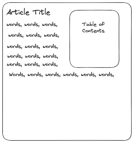
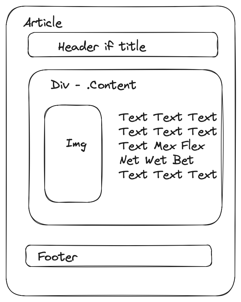
The problems arise from my previous decision to allow for images to float along side content for a post and still remain within its container1.
Diagram showing structure of an article.
This lead me to a small crisis of confidence. Am I putting too much effort into use cases that 99%of the people using the theme are never going to see? Am I essentially playing wack-a-mole trying to handle anything that is sent as content?
I don’t know what the future might hold as far as content, but I do know that most of the posts with titles that I - the theme creator- writes have some kind of code in them.
So that leads us into how do I fix this problem?
The Problem
The problem is actually multiple different scenarios.
Code within a paragraph
Code blocks
Code blocks with a language tag
Code blocks with a language tag and highlights
I decided that I would start at the bottom and work my way up because it looked to be the hardest problem. To test my work I made
code-blocks.md on my local system and placed a copy as a post my test blog. Feel free to use it to follow along at home. Please be aware that sometimes, the text processor makes the quotes “smart”2!
Code blocks with a language and highlights
This was hard for me to solve.
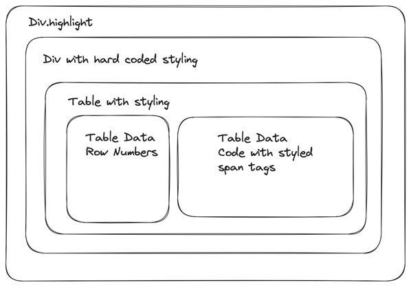
Hugo uses goldmark to process the markdown and then pygments to color things. The resulting export is essentially a table wrapped in a couple of divs.
I created this simplified diagram to illustrate my mental model.
Sometimes automatically generated code can be complicated to read.
I did some additions to the .highlight class in my style.css in order to get it to fit. I created a value called --max-width-value that my <body> now uses and then set the .highlight to use the following.
After that I noticed that the individual spans and divs weren’t working so I added the additional block below.
.highlight>div{width:fit-content;}
Within the table, there is a <pre> and <code> tag that both have hardcoded values. I suspect that these are the defaults and could probably be changed in the config.json file, but I don’t know how to change them at this point in time. Maybe a later iteration.
For now, I set values in my css for the <pre> tag so that I don’t inadvertently change something in code.
Within that table, everything is styled by <span> tags. I don’t make any changes to those because I’m at the limit of my current knowledge.
Code blocks with a language tag
These are not placed in a table, but still use the .highlight class so I get most of the changes that I had put in for the previous scenario. The problem testing what would work for both.
Code blocks
This does not use the .highlight class. It does use a <pre> tag with some hardcode values. I added some padding on the top and sides to this example and should make more examples to test it out.
Code within a paragraph
I feel that <code> within a paragraph should probably stand out versus the code blocks on the page.
I’m going to continue tweaking the colors and rules a little bit more for code blocks. This post is actually another good example of how it is used. I would really like some feedback or better examples on how to work with this, but I think I’ll save any energy I have on finding a better font for this.
References
While working on this issue, I used the following tools.
There are couple examples that I would pull from that had a minified version of their css file. I used this to get a better read at what they were doing.
I did an “official” point release for the Labarum theme last night. I had previously been keeping the version number in the site-head.html and did not change the plugin.json file that would alert the different workflows that a change had actually happened.
What is new
In addition to the the changes in my last post, I added some margin to all images, figures, and videos on the site to better handle some of the content that is added from other sources than MarsEdit and Drafts.
I also used the same styling on the navigation links as I do the articles. This will make them more legible. For all of the talk about accessibility, I was using the contrast between the article background as a test and not the background that you normally see.
All your base
In my last post, I mentioned that I wasn’t using any plugins.
Turns out, because I wasn’t using them, I didn’t know that some of them weren’t working. In one case, the Search Space plugin by @sod.
After looking into it a bit more, it turns out that I had set the <base> element in my head for the theme. This causes all relative links to go to the base1 of the website. In this case, it made what should have been https://mandaris-test.micro.blog/search-space/minisearch.js into https://mandarismoore.com/minisearch.js. As an added problem, footnotes would go to the main page of the site as well. I didn’t see it because I only looked at my articles on the main page and hadn’t looked at my older post in a while.
Strangely enough, I’m actually a lot more confident in the quality of my theme after finding this issue.
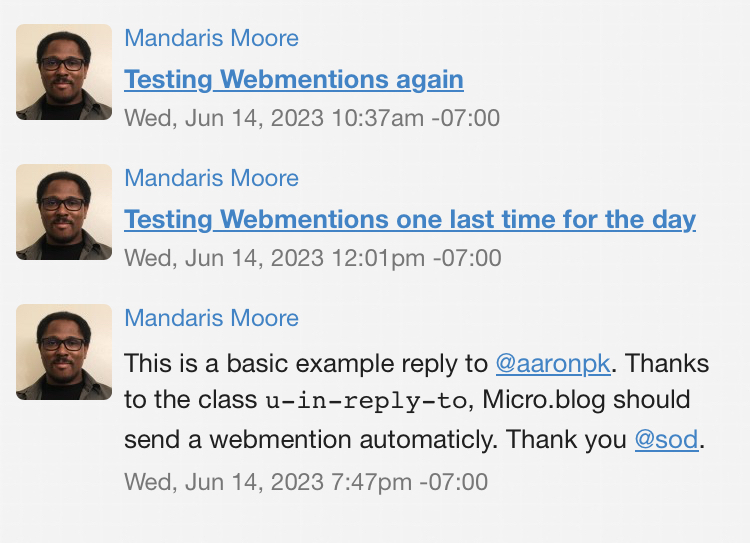
WebMention
This is a small little change that most will never see, but I’ve added some code to improve what is parsed when you use a webmention. Some of this is really dependent on what kind of client someone is using to parse the Webmention, but I feel that this follows the specs pretty well.
What’s the next step?
I’m going to continue to reevaluate the way that site looks to me. To paraphrase @pimoore, “theme design never ends, it goes on hiatus”.
I’ve identified the following things that could use some improvements.
Improving the way code and code blocks look. Code blocks look really, really and break out the article > div that they are in.
Change the responsiveness of the site in general. This is one of those “It works on my machine” situations. The margins of the site are all based off of an example that I found years ago that worked on my devices. I want to make sure that it’s “better” or at least not worry about it not being perfect2.
Refactor CSS. It’s getting harder for me to read what I put in there. I’ve been given a suggestion on how to organize it. I’ll probably tie this into the effort to change the responsiveness of the site.
Update the README.md. I want to quickly see all the things that this theme has to offer without having to browse my site or apply it to their own.
With all that said, I want to spend the next 20 to 30 days focusing on the content of the site more. I’ve put a lot of energy into how the theme works and I want to do more writing and podcasting. I found that I started comparing my theme to others and it was taking some of the fun out of it. If I focus on creating stuff, I can have a better understanding of where I want the theme to highlight the things I make.
So, feel free add it as a plugin on micro.blog, browse the code on Github, or contact me via how ever you got this article.
In hindsight, I should have known and seen the problem earlier. ↩︎
Just a lot of little things got in the way, and I started to sit on changes that I have made. I’m hoping that this post will be me getting back into publishing changes and why I am making them.
This whole post probably should have been run through a grammar checker, but I felt that if I did that I wouldn’t be able to finish it. I welcome feedback so that the next post is better!
Floating Images
Right before Micro Camp, I used MarsEdit to write a post and I used one of the built in alignments to float the image to the left. I was hoping that it would look the way I remember old newspaper articles being.
Although it did have the text wrapped properly, the image “escaped” out of the article and onto the following article.
This was at the same time that there was a discussion about floating images in the help. With this information, I created a little demo post to help me evaluate the preconfigured defaults in MarsEdit.
The way, I got to it was dragging an image onto a post to get to the Upload Utility, but you can also access it from the Window menu.
From there, you can select the options in “Format” or click customize.
Afterwards, you can add more styling to the markup of the image so that future post can use what you’ve been working on.
This works for smaller images, but fell apart when I used a long image with small text. I went on a very long online journey look at grid and flex box until I ultimately, came to the following code that expanded the <div> that I use for the content of the post.
.post-body{display:inline-block;}
Three lines and it only took me hours.
Handling Transcripts
I had some code that would check if the post has a transcript for a podcast associated with it. That’s been removed as micro.blog automatically adds this for you. Thank you, @manton.
No Longer Published
I think people can figure out when this is released
When I first started working with the theme, I thought I would show the modified date and published date so that my users could quickly tell when something had been updated.
Looking at other themes, I don’t see many that have this information and it’s assumed that any date on the post is when it was published. I’m still keeping mine on the bottom for now. Although, I sometimes thinking about how a post might be more comparable to a journal entry or letter to the world.
Center Navigation Menu
Most of the other items on the page are centered. For example, the articles and footer. I centered this and gave it some margin.
Describe me
I’ve been using .Site.Params.description incorrectly. I’ll be using .Site.Params.itunes_description for the description used in the main page meta data.
No Comment
I moved comments from the posts off of the main page and out of the article block that they would normally be in. This meant moving the following code from the partials/article-footer.html to _default/single.html.
I’m thinking about changes in two different areas.
Styles
The next step is to reevaluate the styles that I’m using for the site. I’ve been adding things as I’ve come across different use cases and I want to make sure that the css file while stands at 496 lines currently is easy to read and understand for Future Mandaris 3 months from now. My friend, Michael, told me about Cube CSS so I’ll be looking into using that as a way to organize it.
I’m not happy with the way that comments look. I’ve decided that I’ll only change the style after I’ve implemented Cube CSS otherwise I’ll only have spaghetti code for the rest of this project.
I’d also like to change the margin between images on the site. For example, this post that I made with the sunlit app. That might be a simple fix that I’d slip into a point release.
After that, I’m planning on making the <code> and code blocks look more seamless in posts and change the font such that they stick out more when reading in a paragraph.
Features
On my site, I don’t use any of the plugins. They should work, but I’d like to make sure that the most popular (AKA the ones that people I follow have mentioned) are working properly.
I don’t see there being a problem because of the nature of the theme, but if you know of an issue, please let me know.
I’ve been thinking about where I want my theme to go next, and have been looking at other themes for inspiration. When I look at the other themes, I see that they usually have the time posted on the post but don’t have text stating that it’s the time that it was posted. There is the general assumption that it’s what the date is for.
In addition, some of them have the date before the posting.
I’ll have to sleep on it.
Oh! Hey! You want to check out my theme and see how awesome it is!?
 Mandaris