Mandaris
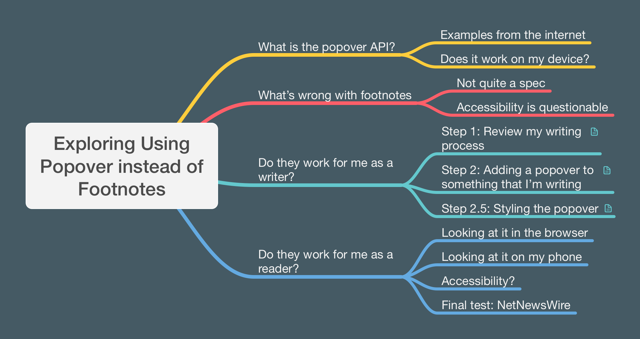
Short answer: no
.
Too long answer: read the rest of the article.
Also, click here to get to the code portions of this article.
The popover api has been baselined
and I really wanted to explore what this feature can do for me and my writing. I thought it would be a simple project of looking into what it is and how it could help me be a better communicator on the internet.
When it comes to using new methods, you are better served by having a target or project. It just so happened that I’ve been thinking about whether or not footnotes are a good solution to adding tangental information to my posts.
So far, I’ve spent 2-3 hours researching and talking about this before I even started writing this article. I lost track how much time it took to get images and tests.
What is the popover API?
To put it in my own words, the popover api allows you to define an element in HTML that will pop up and over
the rest of the content. This element is initially hidden and then can be toggled to be visible and above the other elements.
Examples from the internet
I got a lot of this from different resources on the internet. Here are some links to tutorials and examples if you are interested.
- Popover API lands in Baseline
- Written by Una Kravets and she makes it very easy to understand the concept with a nice break down of what separates this from using a modal dialog.
- Dialog dilemmas and modal mischief
- Hidde De Vries has a slide deck with links to articles that he wrote about popover. I was planning on using some of his accessibility suggestions during the writing of this article.
- MDN - Popover
- Very nice documentation page. Don’t forget to check out the examples that they link to.
Does it work on my device?
Yes.
I’m currently using an iPhone SE running iOS 17.4. You should also double check the CanIUse website to see if it’s on your target device.
What’s wrong with footnotes?
I came across footnotes during my introduction to Markdown. I found it to be a great way to place add additional thoughts and information to something that I was writing without diverting too much from what I intended to say.
I still think about how a piece of writing might be improved with footnotes. I use it mostly for jokes and sarcasm at this point and attempt to write more comprehensive paragraphs with single ideas or wrap additional ideas in the current or following paragraph.
I’ve also thought about saving the ideas for footnotes to be a separate post altogether when I’m doing a daily writing challenge and start looking for ideas.
Footnotes still serve a purpose in how they display information and the various tools that have been developed to utilize them have made them easier to read and write.
But there are still a couple things that don’t really sit well with me.
Not quite a spec
Unfortunately, this isn’t something that was originally built into HTML. Most of the Markdown implementations denote footnotes as an extra feature. Although, all the implementations that I’ve used seem to have this on by default.
For example, Goldmark is the implementation that is used as part of Hugo and Micro.blog. It will go through a document and replace the reference to a footnote with a link like the following.
This is a cool idea<sup id="fnref:1">
<a href="#fn:1"
  class="footnote-ref"
  role="doc-noteref">1</a>
</sup>.
This works for single posts but navigation can be confused if there are several posts with different sets of footnotes or is the base attribute is defined in the head of your html causes the anchor to find the link on the URLs main page.
Accessibility is questionable
Years ago, I read this really cool article on accessible footnotes with CSS by Kitty Giraudel. I didn’t implement it at the time because I didn’t want to breach the imaginary threshold of having HTML mixed in with my markdown.
Still, I was curious on how these things get implemented. How does someone who is using a screen reader know that a link goes to a footnote?
When I started looking into it, I noticed that links were also getting assigned different roles. I thought that it was just a workaround.
Apparently, as I was writing this huge rant article, I found out that the role=doc-noteref has been added to the aria spec. It’s because of this that browsers and RSS readers can better parse an article to show a footnote without having to scroll to the content.
I didn’t do further research or testing with screen readers to get more information for this article after discovering this.
Do they work for me as a writer?
I use footnotes mostly for jokes and sarcasm at this point. But I want to be able to tell a story without them. In that effort, I’m attempting to write more comprehensive paragraphs with single ideas. When I process my pieces through a grammar checker, most of them state that my writing is at a high school level. Which I feel is probably the best target to get ideas across to others and not cry too much when I read this post a year from now.
I’ve also thought about saving the ideas for footnotes to be a separate post altogether when I’m doing a daily writing challenge and start looking for ideas. I don’t have too many of those as I do not allot dedicated time to writing and these idea fragments are then forgotten as the initial passion was spent during the writing and editing of the main piece.
To implement the popover for this theme, I felt I would need to break it down into several steps to get it working and see if it would be something that I would continue to use after putting the time into it.
Step 1: Review my writing process
With the first step, I thought it would be broken down into two smaller steps.
- How am I currently writing on my blog?
- Do I write in a way that including tangential content would make a piece better?
I currently use Micro.blog in order to host and distribute my blog. The service has an emphasis on making short posts that you can add images and more to. I like to think of it as one of the first successful twitter alternatives before there were so many that we see. This is generally where 90% of my writing goes and I feel free to post there without worrying a lot about editing.
Looking back, the longest posts are about Micro.blog. Some would joke that my Micro.blog posts are MacroPosts.
If I’m not using drafts or Marsedit, I’m using the application or shortcut to write for my site. I upload pictures of my dog or sending little messages about what is on my mind.
Because of this, I found that my average post length is about 45 words on average.
Very rarely do I find myself tackling multiple ideas in a post.
Step 2: Adding a popover to something that I’m writing
Adding a popover is pure html. I was tempted to create a Hugo shortcode into the theme, but I had a small discussion with Mathew and he pointed out that adding shortcodes could prevent users from changing theme. I could have made the shortcodes into a separate repository that people could use as a plugin, but I didn’t want to make something that would cause work for other theme creators to support.
Anything that I want to add by using this would need to be in the post that I write.
This means that I’m writing this as HTML in my document. For example, I’d write something like the following. Note that I added extra break points for legibility.
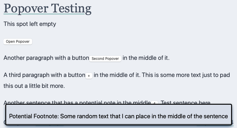
<p>A simple paragraph with a button
<button popovertarget="test-pop">+</button>
in the middle of it. This is some more text just
to pad this out a little bit more.</p>
I would have to add the popover content somewhere else in the post like the following.
<aside id="forth-popup" popover>
<p>Potential Footnote:
  Some random text that I can place
  in the middle of the sentence</p>
</aside>
One benefit of this approach is that I can add footnotes that are multiple paragraphs or images without worrying about having to indent the extra content the correct amount to make sure that it is included.
Step 2.5: Styling the popover
Although this is base line, I would like it to look like it fits into the rest of the theme.
I thought of the implementation as if it were a margin note or aside from the Tufte style of information visualization. This way, I can use the styling with my regular
writing if I don’t want it to popout. I also used the nested css syntax to keep it all together.
After hacking away on this, I realized that it’s better to group everything together to be consistent.
|
|
- Line 1
- This will effect all elements that have the popover attribute. It was nice to see that I could use this on
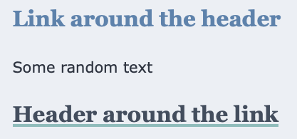
<aside>and not just the<div>that I see with a lot of examples. - Line 2
- I felt that I didn’t want to apply this to all
<aside>tags that are in the theme. I don’t know how many users are adding that tag to their blogs and I didn’t want to make this something they needed to restyle.
The rest is the definition of the <figure> styling rules which have been implemented earlier in the project.
Do they work for me as a reader?
Sometimes, I actually test what I’m implementing. In this case, it is reading things on my blog.
Looking at it in the browser
At this point, I’m not used to having buttons in the middle of a paragraph. The combination of line height and where the button sits makes me feel that sentences are disjointed. There is no styling for the buttons and everything is inherited from the colors of the theme.
In an effort to get done
, I felt that it would be better to ship this and write a check for Future Me to improve.
Oh, here’s a note from Future Me…
You're a lazy and handsome person! I both love and hate you! Future Me
Thank you?
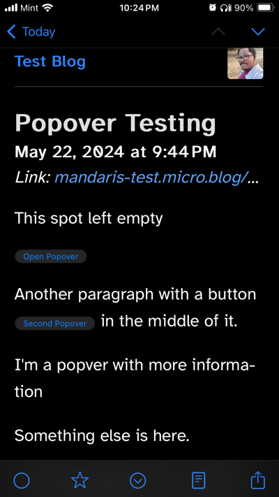
Looking at it on my phone
I can see the popover show up and cover the contents. It can really highlight a point that I’m trying to make, but if I’m trying to make a point it should be within the writing itself.
Accessibility?
One of the good things about this is that this is keyboard accessible. You can dismiss the popover by clicking escape or tabbing and enabling another interactive element if the popover attribute is set to auto which is the default setting.
I am concerned about how I can make the buttons more accessible. I was thinking that I could add an aria-label to them if I continue to use this technique.
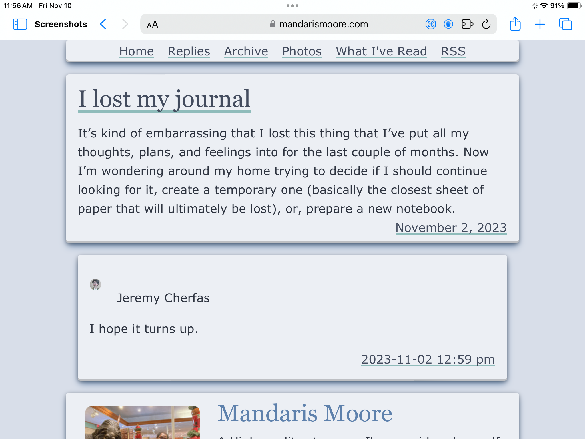
Final Test: NetNewsWire
I read my RSS feeds in NetNewsWire. You can’t see in the screenshot, but the buttons don’t work to show the content.
This gives me an impression that either the article or application is broken and should be skipped so that I can read some other feed.
I don’t have the time and resources to go about creating an enhancement in NetNewsWire for this and I do not feel that my usage justifies that someone implement this.
Conclusion
Popovers are not going to work for me at this point for use as footnotes.
In addition to some of the issues that I highlighted in this article, I’m not comfortable with having elements that I wrote that are not visible. Unlike xkcd, I don’t have hidden text as a bonus for the content.

One other issue that I ran into while testing is how posts show up in Micro.blog listing interface. I attribute this to the popover api being newly available and an edge case for this writing.
This was a fun exercise, but I think I’ll continue with using footnotes as they are currently implemented. Hopefully, the popup api is used for cool things before it becomes the thing we all disable it for forcing us to look at ads.