During my Micro Camp presentation, I stated that the first publication is the first iteration…
Then I stopped.
Just a lot of little things got in the way, and I started to sit on changes that I have made. I’m hoping that this post will be me getting back into publishing changes and why I am making them.
Here’s a list.
- Floating Images
- Handling Transcripts
- No Longer Published
- Center Navigation Menu
- Changing the descriptions
- Removing Comments off the main page
- What’s next?
This whole post probably should have been run through a grammar checker, but I felt that if I did that I wouldn’t be able to finish it. I welcome feedback so that the next post is better!
Floating Images
Right before Micro Camp, I used MarsEdit to write a post and I used one of the built in alignments to float the image to the left. I was hoping that it would look the way I remember old newspaper articles being.
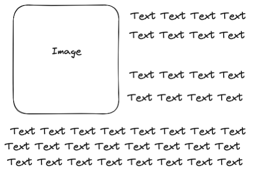
Although it did have the text wrapped properly, the image “escaped” out of the article and onto the following article.
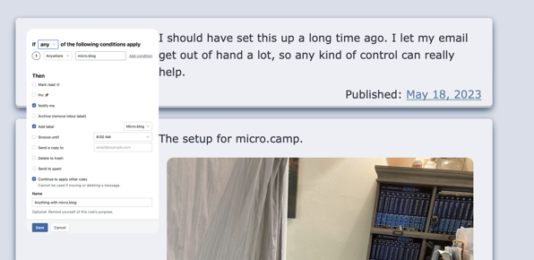
This was at the same time that there was a discussion about floating images in the help. With this information, I created a little demo post to help me evaluate the preconfigured defaults in MarsEdit.
The way, I got to it was dragging an image onto a post to get to the Upload Utility, but you can also access it from the Window menu.
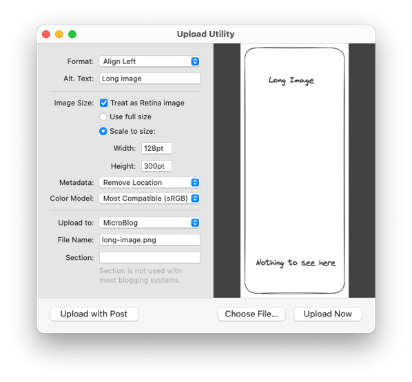
From there, you can select the options in “Format” or click customize.
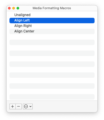
Afterwards, you can add more styling to the markup of the image so that future post can use what you’ve been working on.
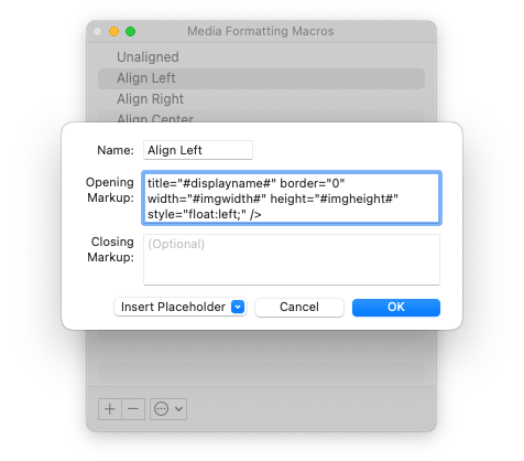
This works for smaller images, but fell apart when I used a long image with small text. I went on a very long online journey look at grid and flex box until I ultimately, came to the following code that expanded the <div> that I use for the content of the post.
.post-body {
    display: inline-block;
}
Three lines and it only took me hours.
Handling Transcripts
I had some code that would check if the post has a transcript for a podcast associated with it. That’s been removed as micro.blog automatically adds this for you. Thank you, @manton.
No Longer Published

When I first started working with the theme, I thought I would show the modified date and published date so that my users could quickly tell when something had been updated.
Looking at other themes, I don’t see many that have this information and it’s assumed that any date on the post is when it was published. I’m still keeping mine on the bottom for now. Although, I sometimes thinking about how a post might be more comparable to a journal entry or letter to the world.
Center Navigation Menu
Most of the other items on the page are centered. For example, the articles and footer. I centered this and gave it some margin.
Describe me
I’ve been using .Site.Params.description incorrectly. I’ll be using .Site.Params.itunes_description for the description used in the main page meta data.
No Comment
I moved comments from the posts off of the main page and out of the article block that they would normally be in. This meant moving the following code from the partials/article-footer.html to _default/single.html.
Thank you, @Miraz for helping me make up my mind.
What’s next?
I’m thinking about changes in two different areas.
Styles
The next step is to reevaluate the styles that I’m using for the site. I’ve been adding things as I’ve come across different use cases and I want to make sure that the css file while stands at 496 lines currently is easy to read and understand for Future Mandaris 3 months from now. My friend, Michael, told me about Cube CSS so I’ll be looking into using that as a way to organize it.
I’m not happy with the way that comments look. I’ve decided that I’ll only change the style after I’ve implemented Cube CSS otherwise I’ll only have spaghetti code for the rest of this project.
I’d also like to change the margin between images on the site. For example, this post that I made with the sunlit app. That might be a simple fix that I’d slip into a point release.
After that, I’m planning on making the <code> and code blocks look more seamless in posts and change the font such that they stick out more when reading in a paragraph.
Features
On my site, I don’t use any of the plugins. They should work, but I’d like to make sure that the most popular (AKA the ones that people I follow have mentioned) are working properly.
I don’t see there being a problem because of the nature of the theme, but if you know of an issue, please let me know.