I wanted to create a new theme for Micro.blog, and I thought I would document all the steps that I went through. The creation of the theme was an iterative process for me and this tutorial works in that way. I’m also not a web designer and I’ve focused mostly on the technical aspect of this theme. This theme and tutorial were put together over the span of a couple months and things changed both in some of the technical aspect and how I thought of the theme.
Design Goals
The first thing I wanted to make sure of was that my theme would be accessible. I want people who use a screen reader to be able to navigate the site without a problem and meet the latest standards as defined by WCAG.
Secondly, I wanted the site design to be semantically correct. I understand that many designers used dev tags for a lot of their design and architecture, but I wanted people who come to my website to be able to read the source and learn from it.
Third, I want to be able to make the design that has been siting in the back of my mind for a while. I’ve been enjoying minimal designs for years. I think this is mostly in part from my years experiencing dial-up and having to sit there and wait for the site to render because whoever paid for it needed me to see their huge logo and hero images.
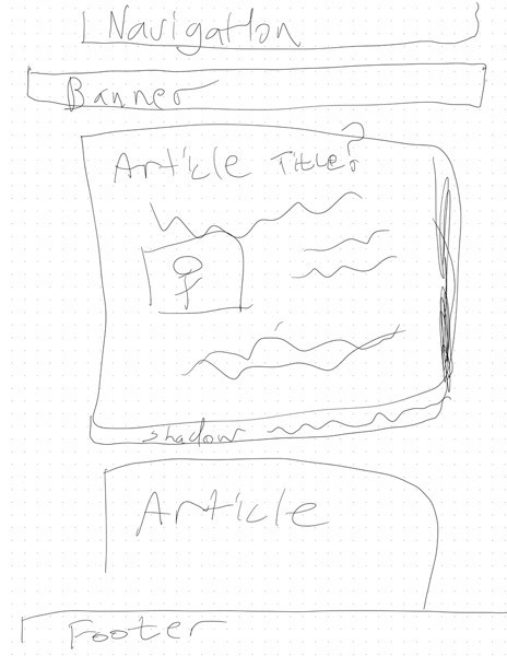
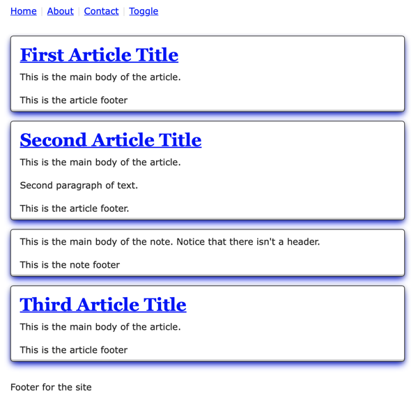
This is what I’ve been picturing for the main page.
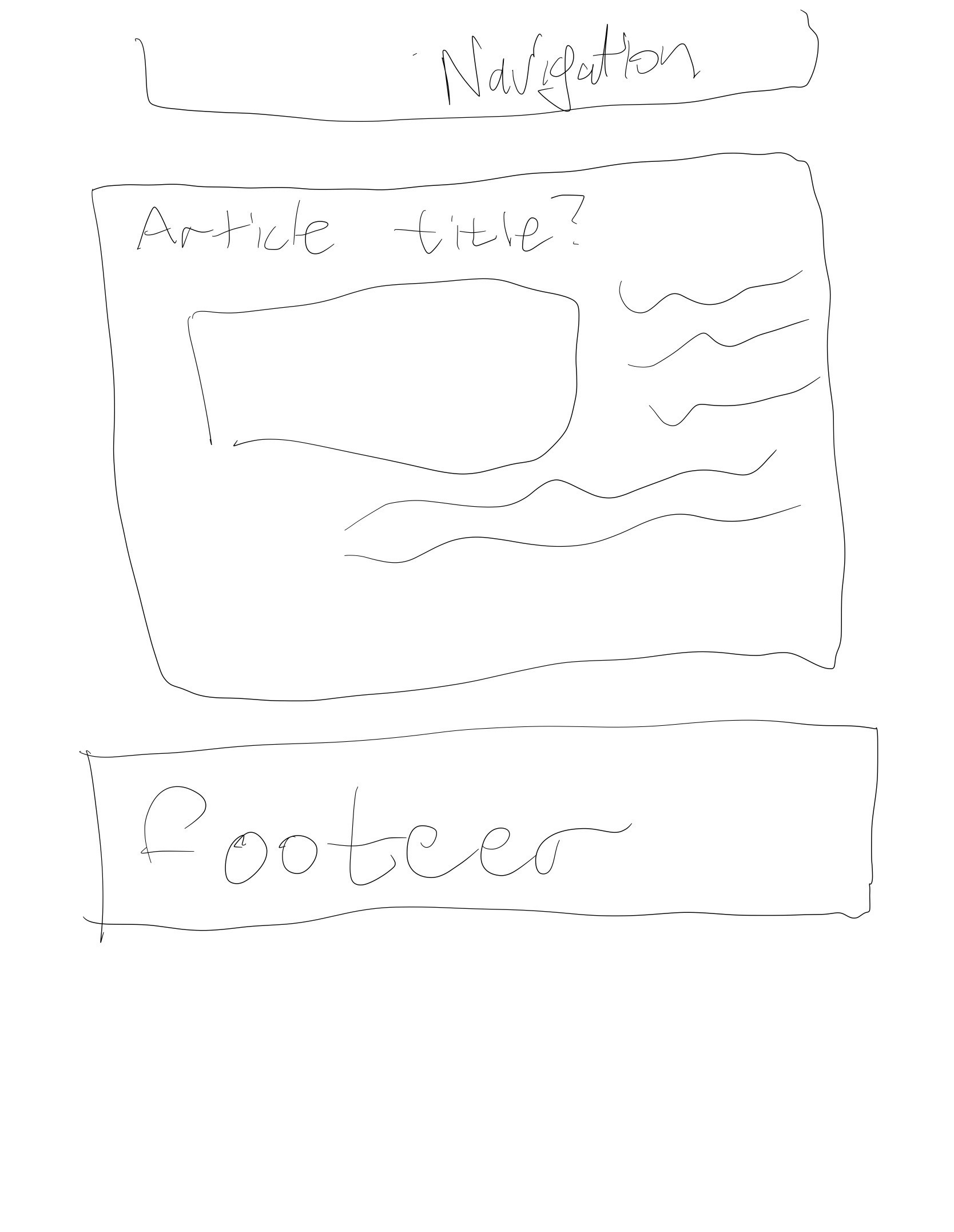
This is what I’d like to have for individual pages.
Understanding Micro.blog
To make it clear, I do not want to know what the secret sauce that Manton applies to make the whole site work. I know I would continually want to dabble. Manton has really done some magic to make Micro.blog work as both a blogging platform and social network. I feel that it offers an exciting mix of features without me having to spend a lot of time doing a lot of the technical configuration that I both equally hated and enjoyed.
But old habits tend to die hard and I found myself wanting to customize my own site and Micro.blog allows you to do that. When I look at new projects, I tend to visualize how the different components come together. For me - as it is near Christmas at the time of this writing - I think of Micro.blog as a Christmas tree.
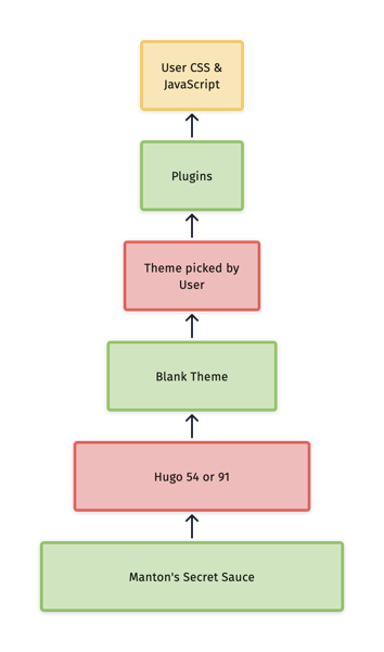
I do want to have an understanding of how themes are put together so that I can customize it. The beauty of working with this system is that every thing that I’ll be doing to customize will be backed by the Blank theme. I also only want to focus on how the site is generated. Every thing else, I leave to Manton Magic.
Setting up my local environment
The first thing that I did was make sure that I had Hugo installed on my machine using Homebrew. I did this to get an understanding of Hugo which is a big part of Micro.Blog. At the beginning of this project, you had to make changes to the Git repository that your theme was hosted on and then add it as a new theme in Micro.blog to see it refresh. I thought that if I do most of the initial development on my system, I could save time with doing smaller iterations on my home system.
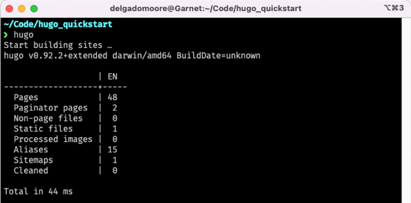
It’s a slightly older version than what Micro.blog (v91) is using, but I didn’t want to spend too much time in getting the versions to match up after spending some time reading what the key differences were.
From there I used the standard Hugo command to create a new environment.
hugo new site labarum-hugo
I create a project in GitHub called Labarum and cloned it in the themes directory of the new Hugo site. The was mostly to the .gitignore and README without making my own, but I see that it didn’t include the .DS_Store so I’ll add that as my first local commit1.
I then created smaller repository to host a little html and css experiments called tryout so that could iterate on the design with a static site.
Basic Structure
For the first iteration, I took a lot of the structure from my previous projects2 and just made the basics of what I wanted to be the following.
<html>

<head>
	<meta charset="utf-8">
    <meta name="viewport" content="width=device-width initial-scale=1">

    <title>Boxes</title>
	<link rel="stylesheet" href="./css/normalize.css" />
	<link rel="stylesheet" href="./css/style.css">
    <link rel="stylesheet" href="./css/custom.css">
</head>


<body>

<nav>
	<menu>
		<li><a href="#">Home</a></li>
		<li><a href="#">About</a></li>
		<li><a href="#">Contact</a></li>
		<li><a href="#">Toggle</a></li>
	</menu>
</nav>

<main>
<article>
	<header>
		<h1><a href="#">First Article Title</a></h1>
	</header>
	<section>
		<p>This is the main body of the article.</p>
	</section>
	<footer>
		<p>This is the article footer</p>
	</footer>
</article>
</main>
<footer>
	<p>Footer for the site</p>
</footer>
</body>

</html>
Please note that I added a note to normalize.css. I thought it was interesting that a lot of the themes that I see in the Hugo theme library link to a version of normalize, but it didn’t seem like it was the latest. I don’t know if they are just optimizing for classes that aren’t in most sites, but I thought I would take the version from the GitHub repository and make it part of my theme. I feel that you never know what the end user of this theme is going to use it for and this will cover most cases and they can change the rest.
Initial Designs and Iterations
I also took some of the colors from the Pure project I was working on to help me figure out how I wanted some of the colors to look.
This is the first iteration of light mode.
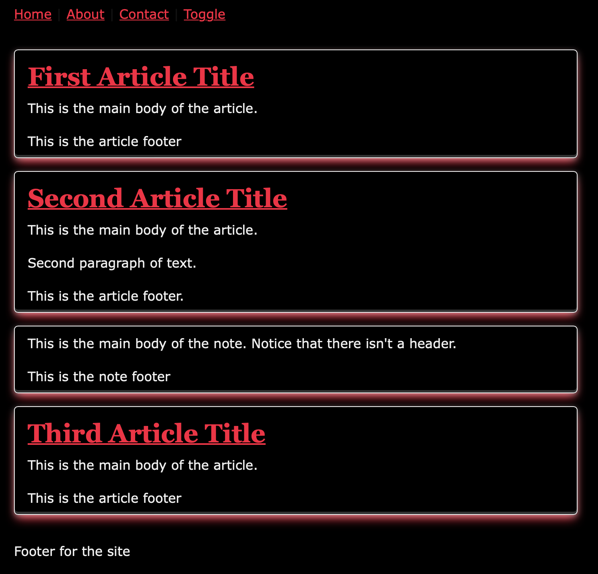
Then I thought I’d put some time into the dark theme.
During the first iteration, I also decided to drop the heading for the page as I felt that if someone came to my page they would be more interested in the articles than what the title was.
For the second iteration on the design, I added places more information about the categories, tags, and the dates something was published and modified. I played around with using a details and summary tag, but it was getting a little too much outside of my abilities and I wanted to move on to other portions of the design.
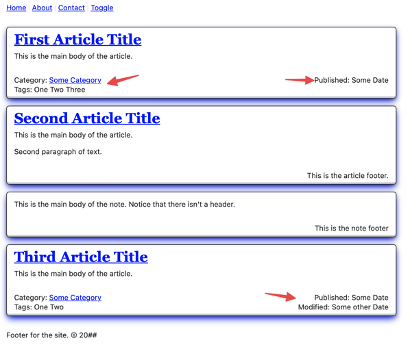
If you noticed, I haven’t put any work towards the navigation yet. I thought that I would see what the site looks like when some test content before I decide on it.
But first it’s important to start moving this into a template.
For Hugo, you need to have layouts/_default/baseof.html. We’ll take the entire example that we were working on and put it in the same format that Hugo is expecting.
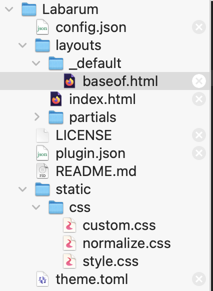
In the baseof.html, we’ll add the following block.
{{ block "main" .}}{{ end }}
Then we create a layouts\index.html file for later version of Hugo with the following content:
{{ define "main" }}
<p>This is the index page</p>
{{ end }}
Then when we run hugo server -D on the command line, the page will render and you might see something like the following.
~/Code/labarum-hugo
❯ hugo server -D
Start building sites …
hugo v0.94.2+extended darwin/amd64 BuildDate=unknown
WARN 2022/06/16 21:11:52 found no layout file for "HTML" for kind "taxonomy": You should create a template file which matches Hugo Layouts Lookup Rules for this combination.
WARN 2022/06/16 21:11:52 found no layout file for "HTML" for kind "taxonomy": You should create a template file which matches Hugo Layouts Lookup Rules for this combination.
The site should look like the following at this point.

Pretty plain. And -again- this is mostly the static content that I created.
Let’s get rid of the warnings first, that way, we can focus on anything that pops up as we build the rest of the template.
Creating taxonomy/list pages
Let’s go to the Hugo’s documentation on template lookup order and search for taxonomy, and it lists different options. I think we’ll make layouts/_defaults/list.html which matches what we see with the base template that blank template that micro.blog provides.
We’ll just stub it for now.
{{ define "main" }}
<p>This is the basic list.html file</p>
{{ end }}
Now we have a “clean” build of our site that shows pretty much nothing other than the box example that we created.
We can start the Hugo server and go to /posts/ to see the new posts page.
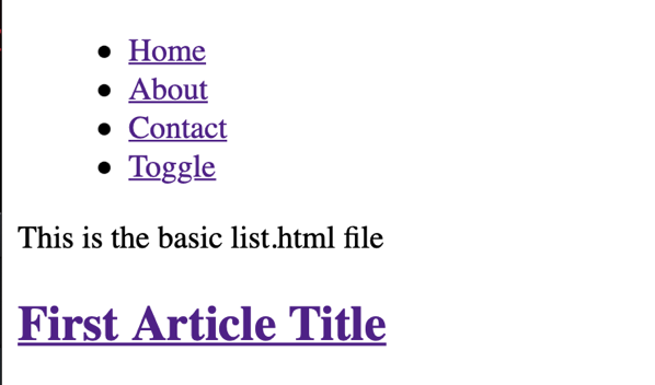
Notice that it doesn’t have the css linked properly. This is because our css used ./css and we have to remove the dot so that Hugo serves in properly. There are other ways of referencing this that we’ll look into later in this series.
We can now get really started!
Let’s make our first post by using the “Add Some Content” step from the Hugo Quick start.
After creating the content, we run the hugo -D command if the server isn’t running to get the output. At this point, we see another warning about pages.
❯ hugo -D
Start building sites …
hugo v0.94.2+extended darwin/amd64 BuildDate=unknown
WARN 2022/07/05 18:19:20 found no layout file for "HTML" for kind "page":
You should create a template file which matches Hugo Layouts Lookup Rules for this combination.
We go back to the template look up and find the information on making a page. We’ll just make a simple stub for now.
{{ define "main" }}
<article>
<header>
<h2>Article Title</h2>
</header>

<section>
{{ .content }}
</section>

</article>

{{ end }}
Now when we run, we don’t see any warning!
But.
It doesn’t do anything dynamic at this point and all we see is a page with just one line of text.
We’ll have to do that in the second part. Please give me some feed back before I push out the next part two days from now.