 Mandaris
"Turn Tables" by Peter Alfred Hess is licensed under CC BY 2.0.
I’m rolling out another update to my theme for Micro.blog. It took a lot of time and effort on my part. It definitely reminds me of the story about how people paint both the front and back of a fence. I don’t think most will know or use some of the things that I put into this. If you do use or learn anything from this, I would really appreciate you sending me a message.
I’ve been doing small tweaks to the theme for the last couple of weeks as I learn more and more about CSS. I had even posted about how I had started working through the material found in Kevin Powell’s Conquering Responsive Layouts course and got a couple of responses that pointed me to further research.
There are plenty of miscellaneous changes that I put in related to accessibility and edge cases for HTML elements.
Back on the (code) block
I’ve been working on code blocks for a while. I don’t think there are many blogs on micro.blog that feature code as a regular part of what they publish. It’s very important to me that as someone who is writing about the code of the theme that it can be read.
It haunts me.
I was ok with the fact that the code blocks worked well with Hugo version .91 but, with the availability of .177, I couldn’t ignore the problems that I saw.
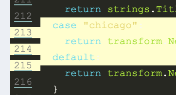
Here is a picture of what I’m referring to from my post celebrating the announcement.

The underlining issue is that the default properties for the theme and Hugo is to place the styling inline of the HTML. AND, that I’ve opted to use display: inline-block for the <div> that is the container for my blog posts.
To better explain the issue, I’ll use the following snippet found in the Hugo documentation about code fences and put it in one of my posts, I’d get different results based on the version of Hugo that I’m running.
```go {linenos=table,hl_lines=[1,11,"15-16"],linenostart=199, anchorlinenos=true, lineanchors=small }
// GetTitleFunc returns a func that can be used to transform a string to
// title case.
//
// The supported styles are
//
// - "Go" (strings.Title)
// - "AP" (see https://www.apstylebook.com/)
// - "Chicago" (see https://www.chicagomanualofstyle.org/home.html)
//
// If an unknown or empty style is provided, AP style is what you get.
func GetTitleFunc(style string) func(s string) string {
  switch strings.ToLower(style) {
  case "go":
    return strings.Title
  case "chicago":
    return transform.NewTitleConverter(transform.ChicagoStyle)
  default:
    return transform.NewTitleConverter(transform.APStyle)
  }
}
```
Hugo will render this as a series of nested spans in a table in a couple of divs. For example, the span that contains the line number would be div.highlight > div > table > tr > td:first-of-type > pre > code > span.

Each level of this structure may have its own inline styling.
Going back to the code snippet, with version .91, I would get the following output for the highlighted line 213 (the one that with ‘case “go”’). I changed the spacing for legibility.
<span style="display:block;width:100%;background-color:#3c3d38">
  <span style="margin-right:0.4em;padding:0 0.4em 0 0.4em;color:#7f7f7f">
    213
  </span>
</span>
With version .117, you would get the following output for the same line.
<span style="background-color:#3c3d38">
  <span style="white-space:pre;-webkit-user-select:none;user-select:none;margin-right:0.4em;padding:0 0.4em 0 0.4em;color:#7f7f7f" id="big-213">
    <a style="outline:none;text-decoration:none;color:inherit" href="#big-213">
      213
    </a>
  </span>
</span>
Note that this version allows use to set anchors for the individual lines as well as a prefix.
At this point, I realized that I needed to have a better way of controlling the behavior of the different elements. Luckily, the documentation for Hugo Highlighting configuration has a noClasses flag that we can set in the config.json of the theme.
{
    "params": {
        "showTableOfContents": false,
        "showAuthorInfo": false,
        "showDebugInfo": false
    },
    "markup": {
    	"highlight": {
    		"noClasses": false
    	}
    }
}
With the noClasses set to false1, the line that we’ve been looking at gets rendered to something like below.

The example is legible without the color and inline formatting.
To put the color back into the example, we refer to the documentation on how to generate syntax highlighter CSS to get the colors. I used the example that they provided so that I could compare it to the defaults.
hugo gen chromastyles --style=monokai > syntax.css
Then we add the newly created css file to our site-head.html to represent that syntax color is important but that the style.css is the final say for customization from the theme.
Unfortunately, the lines to do not … um… line up and the colors don’t match up with what we’re expecting.
After some experimenting with Firefox developer tools, I added the following to the style.css to get the lines to match.
.chroma {
  overflow-x: auto;
}

.chroma .lnt {
  display: flex;
}

.chroma .hl {
  display: flex;
}
The color for the highlight appears to be incorrect for all the styles that I tested, so I went back to an earlier version of Hugo to get the color and then placed it in the style.css as well.
.chroma .hl {
    background-color: #3c3d38;
    display: flex;
}
I also created a bug report about Chroma styles for line highlighting are not using the correct color.
As the last step, we remove the box-shadow from the links in the table.
.lnlinks, .lnlinks:hover {
    box-shadow: none;
}
The results of the highlight experiments
So the following is what the code looks like afterward.
|
|
You can also link directly to lines (for example, line 213) and it should work. It also scrolls side to side to accommodate the longer lines.
Showing the table of contents
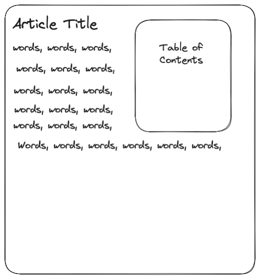
When I get frustrated with code blocks, I look at other aspects of the theme and what’s available in Hugo and Micro.blog. Hugo offers built in table of content short code that can be used in the themes. You can read more about it in the online documentation.
My first idea was that I wanted to have a property that users could turn on to automatically add the table of contents to a post. I came across this feature in the Cards Theme for Micro.blog and thought that it would be a nice feature for those who write a long post.
I create _partial\toc.html with the following code that I would put above the <div> that that contains the contents of an individual post.
<aside class="[ TableOfContents ] [ style-box-alt ]">
  <h2 class="[ TableOfContentsHeader ] [ text-center ]">Table of Contents</h2>
  {{ .Page.TableOfContents }}
</aside>
This would render as an empty box if there were no headers in a post. After a lot of experimenting, I came up with the following.
.TableOfContents {
  display: none;
  margin: 0 auto;
  width: 90%;
}

.TableOfContents:has(ul) {
  display: block;
  float:right;
  margin-left: 1em;
  margin-right: 1em;
  margin-bottom: 1em;
  padding-right: 1em;
}
Line 2 makes the default state of the table of contents hidden and then line 7 checks to see if Hugo has rendered a <ul> within whatever is in the .TableOfContents class. If it’s true, then line 8 will set the display type to a block; making it visible.
Problem Opportunity
Unfortunately, I ran into a number of issues.
- It does not take into account older posts that already have table of contents
Most of my posts about labarum have headers and I do not want to go back and edit all of them. Some users might only want a table of contents that they specify themselves. - It obscures posts that start off with a big “hero” image
I have a couple of posts like this and the floating of the table of contents did not look correct. I will have to come back to this when I’m a little better with CSS. - This technique does not currently work with Firefox
The table of contents does not show up on Firefox. I tried experimenting with different logic to toggle the visibility, but ultimately, I couldn’t get it working. I don’t know how many people are using this theme or how many people come to my site using Firefox, but I really, really want people to be able to read this. NOTE: I wrote this on August 20th, and then the Firefox nightly build enabled the:hasflag in build 119. Meaning that this will work soon.
I decided to remove the property and make two different shortcodes for table of contents.
The first one is activated by adding {{ toc }} to your text and will float in the center of the article.

The second one is activated by adding {{ floating-toc }} to your text and will float in the right of the article.

Please note that if you place the short codes at the beginning of the post, it will be part of the .summary.
A Standard Head
A while ago, Sven (@sod), mentioned a couple of people on Micro.blog about abstracting some of the code that is used in all Micro.blog themes. The discussion and pull request was on github and it can now be seen in the micro.blog theme-blank.
You can test it out on your local environment by cloning it and placing it with the other themes.
After you’ve cloned the theme, you edit your config.json to something similar to what is below.
"theme": ["labarum", "theme-blank"]
I then edited the partial\site-head.html to have the following:
{{ "<!-- Microblog header begin-->" | safeHTML }}
{{ partial "microblog_head.html" . }}
{{ "<!-- Microblog header end -->" | safeHTML }}
Here is a direct link to the microblog_head.html partial if you want to read over it.
What’s next?
There were a couple of things that I wanted to add to this release but realized that I was stopping progress. In my last two posts about labarum, I told myself that I wouldn’t wait for perfection to happen.
That being said, here are the things that I have on the roadmap for my next release.
Show the Profile Picture
A couple of the other themes on Micro.blog use the profile picture on the site. I do load this picture in the metadata of the theme’s head and articles but an end user doesn’t see that. Part of this is just me not wanting to show my face and not having it in my initial design for the theme.
Enable Mermaid Diagrams
Hugo natively allows for GoAT diagrams2 which are rendereded as SVGs on the site. To enable mermaid, you have to place something in the theme. I’ll be experimenting with and hopefully find a way so that it doesn’t load the associated javascript library if a user doesn’t want to use it.
Reevaluate OpenGraph and other meta tags
There was a pull request and discussion about abstracting the metadata and placing it in “theme-blank”. I currently do this myself and wrote a post about my journey.
I’ll have to read more. I like the idea of having a standard, but I vaguely remember something about why I made the decisions that I did.
CSS responsiveness
Working with my theme makes me appreciate other web developers. Unfortunately, I start comparing my work to others, and comparison is the thief of joy. I’m not happy with a part of the theme that I have. It has to do with how it looks on smaller screens.

Nothing is “wrong” with this, but for some reason, it “does not spark joy”.
I’ll have to take a couple steps back and think about what I want from this.
Break time!
Thank you for getting to the bottom of this article. I certainly hope that you got something out of it.
Please contact me if you have any positive comments or questions!