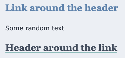
The other day, I wrote a micropost about how I was deliberating on <a><h1>...</h1></a> versus <h1><a>...</a></h1>. I joked and said that I was only thinking about it for 59 seconds and as you are reading this post it has been a lot more than that.
Strictly HTML 4 speaking, headers are block elements and anchors are inline elements. But, in practice, I’ve seen anchors around headers in links and images for just as long.
But which one do I want to use?
I decided that I would do some experiments in my test environment and saw that the touch targets would be just a little larger if I switch the anchor to be outside of the header. Unfortunately, this would also mean that I would have to do a minor rewrite of the CSS.

Another question that I had is what is more accessible?
. I didn’t want to put effort into this if it meant that it would be a problem for people. So I enabled voiceover and navigated the page using the keyboard to get a sense of what it would sound like.
After listening to the two different versions, I created two rules to match up with what I had previously. I ran into a small snag as header is a block element that spans the width of the container.

I then set width: fit-content to make it fit. As a draw back the box-shadow that I was using to underline the link only shows up on the last line and make long titles look a little weird to me. I considered added a span within the header but that feels like too much work.