 Mandaris
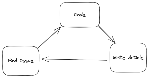
I did an “official” point release for the Labarum theme last night. I had previously been keeping the version number in the site-head.html and did not change the plugin.json file that would alert the different workflows that a change had actually happened.
What is new
In addition to the the changes in my last post, I added some margin to all images, figures, and videos on the site to better handle some of the content that is added from other sources than MarsEdit and Drafts.

I also used the same styling on the navigation links as I do the articles. This will make them more legible. For all of the talk about accessibility, I was using the contrast between the article background as a test and not the background that you normally see.
All your base
In my last post, I mentioned that I wasn’t using any plugins.
Turns out, because I wasn’t using them, I didn’t know that some of them weren’t working. In one case, the Search Space plugin by @sod.
After looking into it a bit more, it turns out that I had set the <base> element in my head for the theme. This causes all relative links to go to the base1 of the website. In this case, it made what should have been https://mandaris-test.micro.blog/search-space/minisearch.js into https://mandarismoore.com/minisearch.js. As an added problem, footnotes would go to the main page of the site as well. I didn’t see it because I only looked at my articles on the main page and hadn’t looked at my older post in a while.
I found this really nice article about what use cases the <base> really shines.
Strangely enough, I’m actually a lot more confident in the quality of my theme after finding this issue.
WebMention
This is a small little change that most will never see, but I’ve added some code to improve what is parsed when you use a webmention. Some of this is really dependent on what kind of client someone is using to parse the Webmention, but I feel that this follows the specs pretty well.
What’s the next step?
I’m going to continue to reevaluate the way that site looks to me. To paraphrase @pimoore, “theme design never ends, it goes on hiatus”.
I’ve identified the following things that could use some improvements.
- Improving the way code and code blocks look. Code blocks look really, really and break out the article > div that they are in.
- Change the responsiveness of the site in general. This is one of those “It works on my machine” situations. The margins of the site are all based off of an example that I found years ago that worked on my devices. I want to make sure that it’s “better” or at least not worry about it not being perfect2.
- Refactor CSS. It’s getting harder for me to read what I put in there. I’ve been given a suggestion on how to organize it. I’ll probably tie this into the effort to change the responsiveness of the site.
- Update the README.md. I want to quickly see all the things that this theme has to offer without having to browse my site or apply it to their own.
With all that said, I want to spend the next 20 to 30 days focusing on the content of the site more. I’ve put a lot of energy into how the theme works and I want to do more writing and podcasting. I found that I started comparing my theme to others and it was taking some of the fun out of it. If I focus on creating stuff, I can have a better understanding of where I want the theme to highlight the things I make.
So, feel free add it as a plugin on micro.blog, browse the code on Github, or contact me via how ever you got this article.