 Mandaris
Seriously considering making “Have a good weekend!” the way that I end my emails.
I want to do some writing but I don’t know how to get started anymore.
If you see this message, I hope that you are doing well.
Instead of being in a funk, I’m going to invest the energy into my next action.
I took a break from the internet for one day and then THIS?!
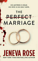
Finished reading: The Perfect Marriage by Jeneva Rose 📚
It is not a good book. I don’t recall the last time I read a book where I was so angry with the main characters. I think I kept going because my wife and I were trying to figure out how this was a best seller.
I know why now because this book just makes you shake your head with the audacity of what happens.
The Hot Chick (2002) - ★★★★☆
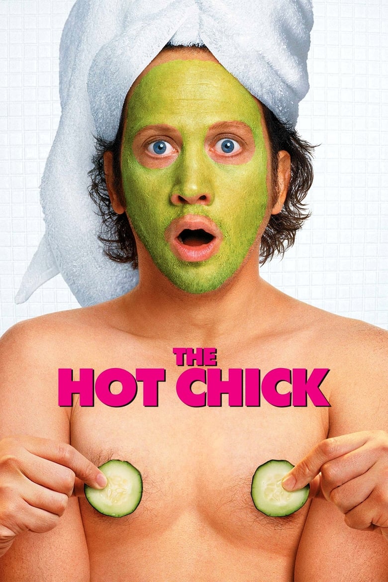
It was a cold that night in December when we decided that we’d ring in the new year by watching movies and eating store bought frozen pizza. 2024 had been a year with a lot of ups and down and we just wanted to have something that would make us laugh.
Just something that we wouldn’t mind talking over or missing a moment because it’s would be vital to the plot
.
This was the movie we chose and I’m happy that I did.
In between the crass jokes - some that are timeless and others that show that they are of a different time1 - I found a couple messages that I could really get behind. Messages about being the best person that you can be, accepting others for who they are, and that relationships are something you shouldn’t take for granted.
Overview
Not only is Jessica Spencer the most popular girl in school -- she is also the meanest. But things change for the attractive teen when a freak accident involving a cursed pair of earrings and a chance encounter at a gas station causes her to switch bodies with Clive, a sleazy crook. Jessica, in the form of the repulsive Clive, struggles to adjust to this radical alteration and sets out to get her own body back before the upcoming prom.
One thing of note was I was watching it with my teenage daughters and fighting the urge to constantly explain that it was made at a different time!
. But, I think that feeling is overblown. I’m sure this isn’t the first time that they heard a dirty joke and probably not the only time. If anything, I was probably the only one who felt uncomfortable.
-
There is some blatant homophobia and mysogony in this movie. I feel that the movie makes it clear that it is not a good view point and it’s coming from someone that we definitely aren’t rooting for. It’s not perfect. ↩︎
Tomorrow, I want to spend as much time as I can just working on getting ready for the weeks/months/years to come.
I don’t think I you should make dog treats look like chocolate chip cookies.

Don’t use the Hugo twitter shortcode! It’s causing render issues!