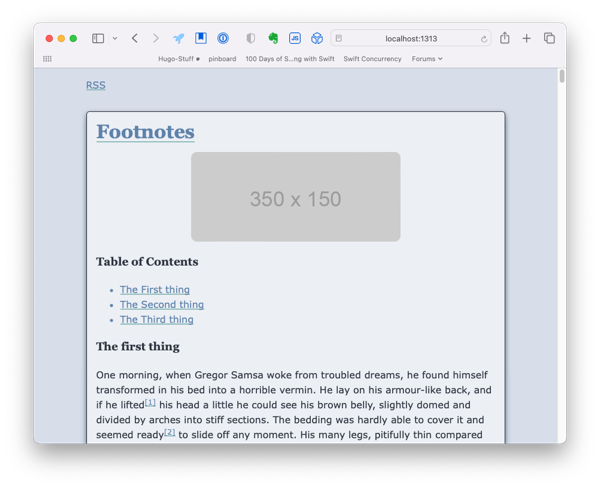
I’m wrapping up this series. I’ve been playing with this theme for more than a year. Rarely consistent and not always forward progress but rewarding. I’m at a point where I’m very happy with how the theme looks.
This is what it looks like in dark mode.
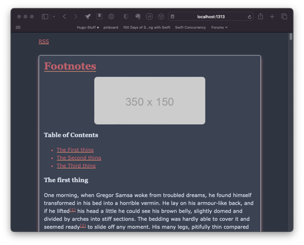
Colo(u)rs
I wanted to use the Nord color scheme at the beginning of this project, but decided to use “basic” colors to simplify the design. I eventually grew to love the look of the page as the content was the star.
Later I found that some of the elements on the page don’t work well for those who are color blind and the starkness of having an all white background made me rethink whether the site would do well with long pieces.
I first came across the Nord color palette when I met Jessica Smith online using the micro.blog service.
Fonts
I did not want to use online fonts.
True, they can look really nice but I didn’t want to use bandwidth on something that could slow down the site or cannot guarantee to work in the coming years. In addition, there are privacy concerns when it comes to web fonts that I didn’t want to contribute to.
After a significant amount of time looking for accessible fonts that are all the major OSes, I went with Verdana for my main text font and Garamond for headers.
Figures
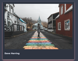
I decided that I wanted the items in a figure to take have the same effect as the articles but take the main background so that it would have a stacking effect.
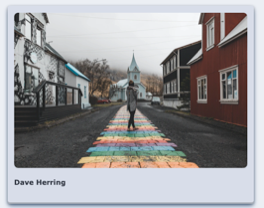
Here are some pictures of what the figures looks like in dark mode.
Tables
I typically don’t use tables in my writing, but I thought I should add a little bit of styling in case someone else feels the need.

Here it is in and dark mode.

Tasks lists
This was the hardest part to solve because most of the Hugo themes do not address tasks lists. To be clear, these are static lists created by the writer and not something a reader is expected to interact with.
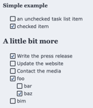
Dark mode for the task list.

Most themes will have something like the following code to remove the markers that show up in an unordered list.
/* task list and its checkboxes */
article ul > li:has(> input[type="checkbox"]) {
    list-style: none;
    margin-inline-start: -1rem;
}

article ul > li:has(> input[type="checkbox"])::before {
    content: "\200B"; /* accessibilty for Safari [developer.mozilla.org/en-US/doc...](https://developer.mozilla.org/en-US/docs/Web/CSS/list-style) */
}
Eventually, I found a wonderful example in the Hugo Relearn theme that was written about on Modern CSS applied it to what I had.
Reflection
I’m happy with the theme.
There are still somethings that I want to improve upon and I invite you all to comment and help me make it better in the future. I’ve also made a post on my test blog that should have a lot of examples of the theme in action.