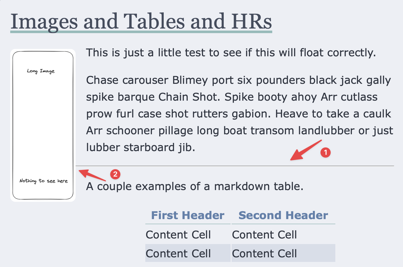
I’m at the point where I’m looking at contrived examples and edge cases where my theme has issues. I don’t write like this but there might be someone who does. In the above picture, I see to problems the first is that the horizontal rule doesn’t really match up with the colors of the site. The second more egregious is that the line is ducking underneath the image.
I used the Inspect feature of the browser to check out what was determining the behavior of the line and saw that the ducking was caused by setting overflow: visible in the normalize.css. This isn’t the first time that I’ve run into an issue with something like this. As the browsers move closer and closer to interoperability, I’ve been questioning whether having normalize.css as part of the theme is important.
Ultimately, I decided to add the following css rule to fix the issues and will have to reevaluate later.
hr {
  color: var(--accent);
  overflow: auto;
}
Feeding the Robots
I’ve been reevaluating the meta tags I had defined in a previous post. I was happy that it passes the validation tests but I’ve been thinking about how I share my writing.
Original, I truncated the description fields because I read that it’s better for SEO. But why? Search is results are getting worse and worse. It’s ultimately up to whatever social network to take the information and display it. Going forward, I am using the .Summary for the description.
I also added a property that allows you to set your mastodon username if you’re using something other than micro.blog.
I tested putting all the meta comments into one line to reduce repetition as in the following.
<meta property="og:title" itemprop="name"
content="MicroPost - {{ .Site.Title}}" />
Unfortunately, the W3 validator marks it as invalid. I switch it to having multiple lines that use the same content. I thought about contacting the people who set the criteria for the test, but decided not to at this time.