 Mandaris
I updated the styling of comments individual posts. I actually rolled this out while ago but haven’t written about it yet.
Background history (feel free to skip)
Every once in a while, I get a response to one of my posts on Micro.blog. The Micro.blog service manages the comments for me and allows me to include them by adding conversation.js to the theme.
The first iterations of the Labarum theme would have the comments of a post show up on the index page. This was nice when I had a couple comments, but I had a few posts that had a dozen replies as part of a conversation.
I decided that if I have new people coming to an index or category list, they would be better served to see what I’m writing about first and then see the comments when they are looking at the individual post.
I moved the comments to load in single.html and was ok with them being indented a little bit to denote that they were comments.
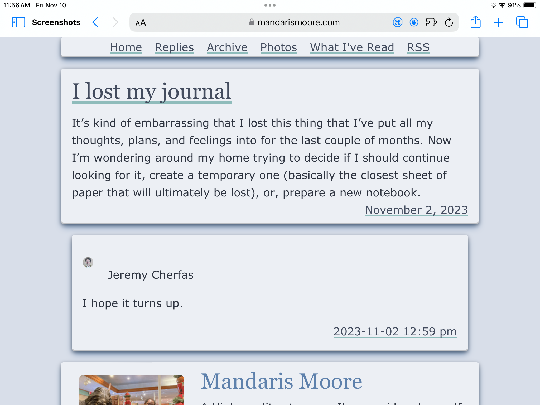
You can find an example of a post with a reply in this post about how I lost my journal.
Promoting the comments
After living with the change for a couple of months, I’ve changed my mind about this design and want the comments to stand out as much as the article. The first step was to change margin to margin-top in the CSS rule for the comment.
The conversation.js places the structure like the following into the final rendering of the webpage
<div class="microblog_conversation">
	<div class="microblog_post">
		<div class="microblog_user">
			<img class="microblog_avatar" src="https://avatars.micro.blog/avatars/Number/Number.jpg" width="20" height="20" style="max-width: 20px;">
			<span class="microblog_fullname">Some User</span>
		</div>
		<div class="microblog_text">
			<p> Some Text </p>
		</div>
		<div class="microblog_time">
			<a href="https://micro.blog/UserName/UniqueIDNumber">Date</a>
		</div>
	</div>
</div>
The name and numbers have been changed to protect the guilty.
Next, we have to add more styling for the avatar picture. It’s hardcoded to be 20 with no units and a max-width but thankfully, it has a class that we can add rules to.
.microblog_avatar {
/*     border-radius: .5rem; */
}
I had a stub for this in the style.css but only had a comment there for future/present me to fix. Thanks for nothing past me. I then did a search and past me actually defined this rule twice!
.microblog_avatar {
	display: inline;
	margin-left: inherit;
}
I’m letting you, the reader, know this because I’m going to invest some time into learning how to clean up the CSS and to show that pobody’s nerfect.
The last comment of this post
After identifying the different components, I played around with the idea of making it looks similar to the way I have the author information at the end of the page. I decided not to at this point in time to focus on the some of the other aspects of the site.