I really wanted to do more writing instead of working on labarum, but I found myself wanting to write more about it. The very first post had examples of code that would render outside of their container depending on how long the line of code was.

It drove me crazy and I would sometimes edit the post in order to avoid the problem.
It was an itch. An irritation.
I needed to fix this.
A cascading problem
Some of the other themes do not have a problem with code blocks at all.
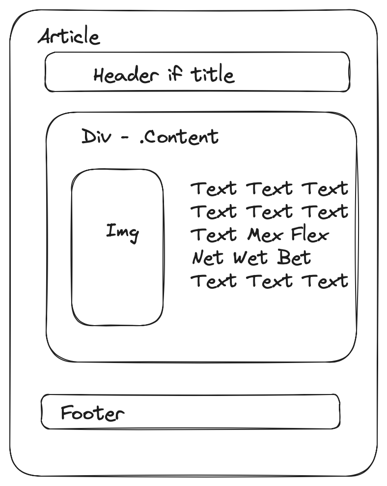
The problems arise from my previous decision to allow for images to float along side content for a post and still remain within its container1.

This lead me to a small crisis of confidence. Am I putting too much effort into use cases that 99%of the people using the theme are never going to see? Am I essentially playing wack-a-mole trying to handle anything that is sent as content?
I don’t know what the future might hold as far as content, but I do know that most of the posts with titles that I - the theme creator- writes have some kind of code in them.
So that leads us into how do I fix this problem?
The Problem
The problem is actually multiple different scenarios.
- Code within a paragraph
- Code blocks
- Code blocks with a language tag
- Code blocks with a language tag and highlights
I decided that I would start at the bottom and work my way up because it looked to be the hardest problem. To test my work I made code-blocks.md on my local system and placed a copy as a post my test blog. Feel free to use it to follow along at home. Please be aware that sometimes, the text processor makes the quotes “smart”2!
Code blocks with a language and highlights
This was hard for me to solve.
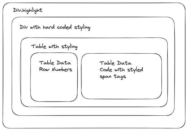
Hugo uses goldmark to process the markdown and then pygments to color things. The resulting export is essentially a table wrapped in a couple of divs.
I created this simplified diagram to illustrate my mental model.

I did some additions to the .highlight class in my style.css in order to get it to fit. I created a value called --max-width-value that my <body> now uses and then set the .highlight to use the following.
overflow: auto;
max-width: calc( var(--max-width-value) - 2rem);
After that I noticed that the individual spans and divs weren’t working so I added the additional block below.
.highlight > div {
    width: fit-content;
}
Within the table, there is a <pre> and <code> tag that both have hardcoded values. I suspect that these are the defaults and could probably be changed in the config.json file, but I don’t know how to change them at this point in time. Maybe a later iteration.
For now, I set values in my css for the <pre> tag so that I don’t inadvertently change something in code.
Within that table, everything is styled by <span> tags. I don’t make any changes to those because I’m at the limit of my current knowledge.
Code blocks with a language tag
These are not placed in a table, but still use the .highlight class so I get most of the changes that I had put in for the previous scenario. The problem testing what would work for both.
Code blocks
This does not use the .highlight class. It does use a <pre> tag with some hardcode values. I added some padding on the top and sides to this example and should make more examples to test it out.
Code within a paragraph
I feel that <code> within a paragraph should probably stand out versus the code blocks on the page.
p > code, kbd {
	background-color: var(--background);
	color: var(--text-alt);
    padding: 3px;
    border-radius: 5px;
}
What is the next step
I’m going to continue tweaking the colors and rules a little bit more for code blocks. This post is actually another good example of how it is used. I would really like some feedback or better examples on how to work with this, but I think I’ll save any energy I have on finding a better font for this.
References
While working on this issue, I used the following tools.
There are couple examples that I would pull from that had a minified version of their css file. I used this to get a better read at what they were doing.
I was told about this tool so that I can reduce the file size for the images in this post.
I love making diagrams!